Luigi CSS
April 10, 2020
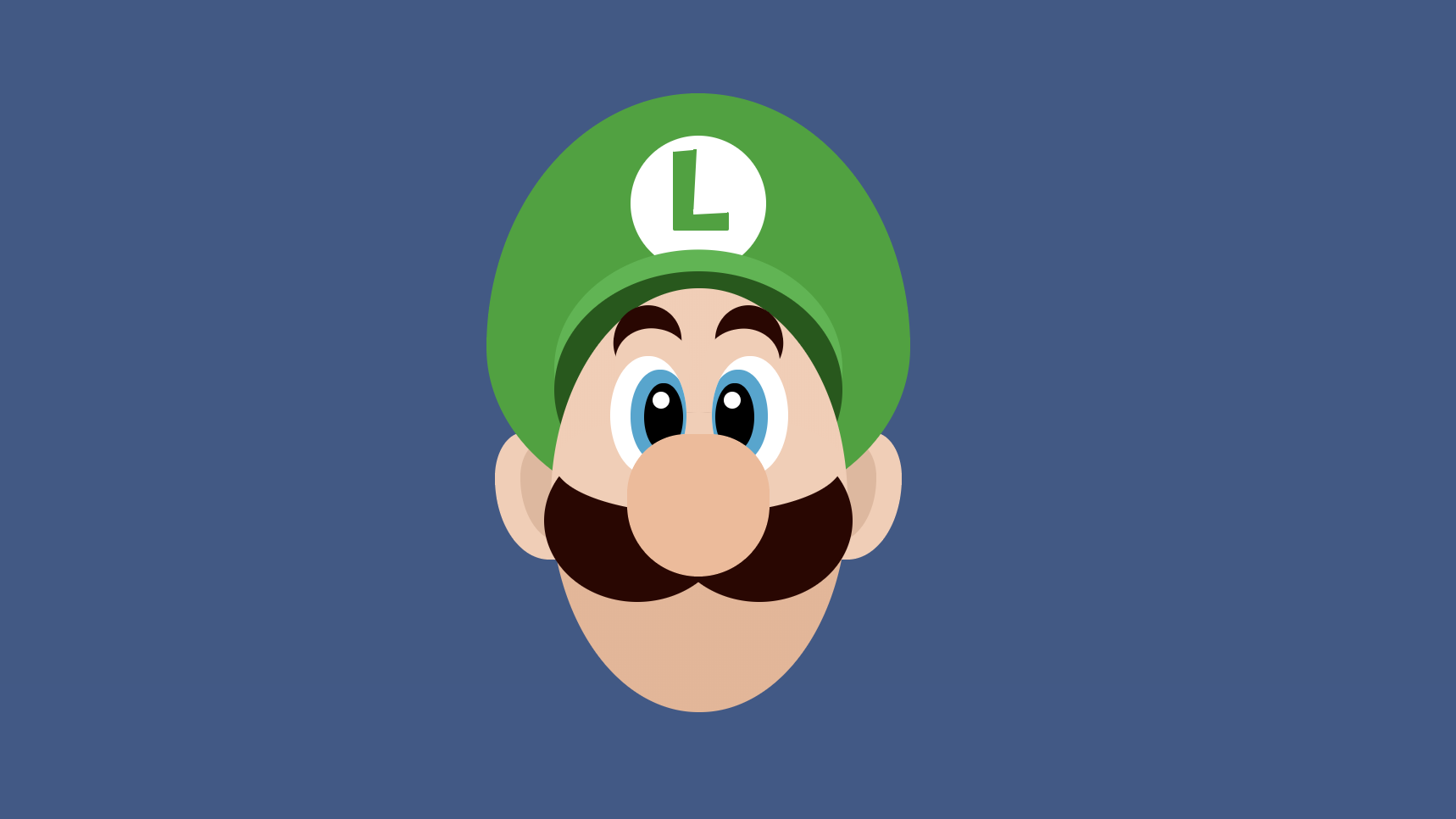
Always the second fiddle, Luigi deserves some love. Inspired by this great dribble illustration, check out how I recreated Luigi in CSS below using a series of ovals.
Luigi's Hat CSS
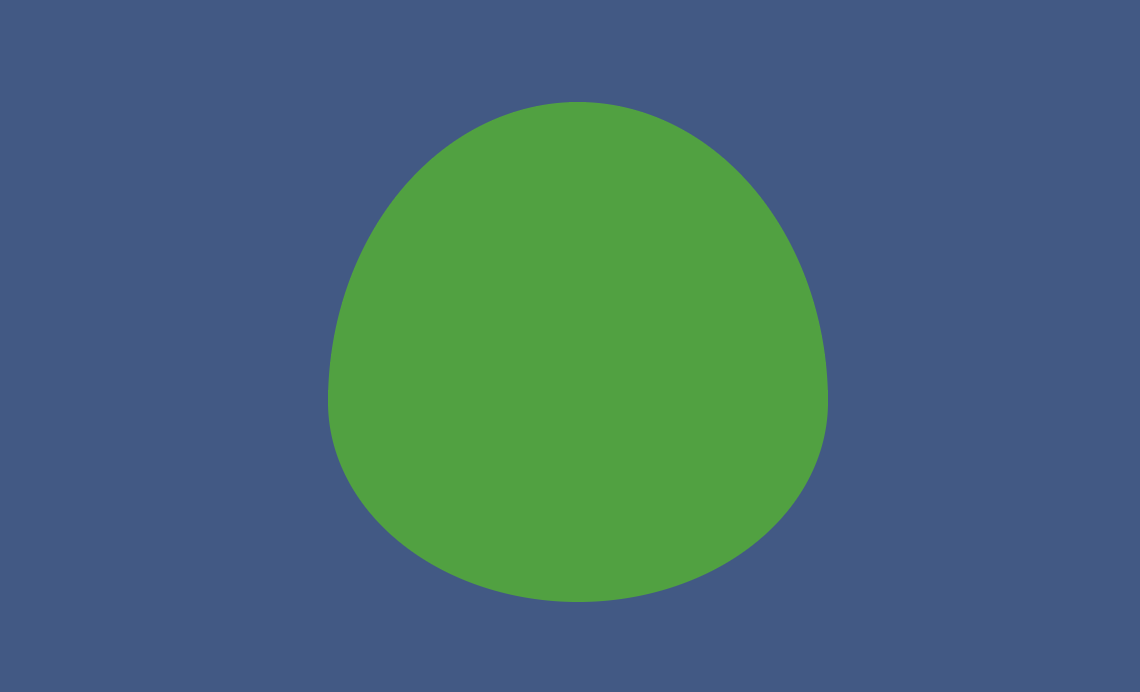
Stripping away all the details on the hat, you end up with what is essentially a fat egg shape that is thicker on the bottom. We can create this shape in CSS by providing 8 values to the border-radius property, which allows us to customize the height and width of each corner's border-radius. Check out the W3C spec on border-radius to learn more about this technique.
1.<div class="Luigi">2. <div class="Luigi__hat"></div>3.</div>
1..Luigi {2. height: 400px;3. width: 400px;4. position: relative;5.}6..Luigi__hat {7. margin-left: calc(50% - 125px);8. height: 250px;9. width: 250px;10. background: #1ca42f;11. border-radius: 50% 50% 50% 50% / 60% 60% 40% 40%;12. position: relative;13.}
Luigi Hat Logo CSS
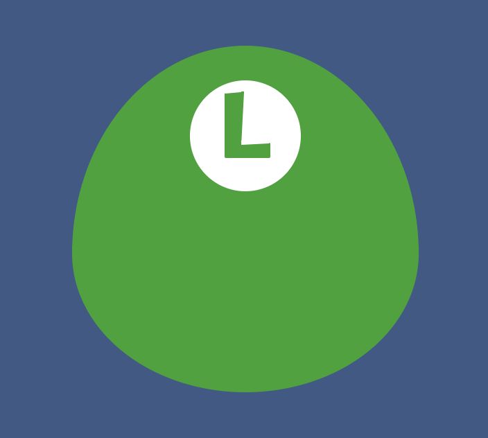
The capital "L" logo is a little more complicated than it looks, because both the stem and branch of the "L" are different sizes, thicker on one end, and rotated slightly. Getting this to look right took a few iterations and pseudo-elements.
1.<div class="Luigi__hat">2. <div class="Luigi__logo">3. <div class="Luigi__stem"></div>4. <div class="Luigi__branch"></div>5. </div>6.</div>
1..Luigi__logo {2. background: white;3. width: 80px;4. height: 80px;5. border-radius: 100%;6. left: calc(50% - 40px);7. top: 25px;8. position: absolute;9. }10..Luigi__stem {11. position: absolute;12. top: 8px;13. left: calc(50% - 15px);14. height: 45px;15. width: 16px;16. background: #1ca42f;17. border-radius: 1px;18. }19..Luigi__stem::before {20. content: "";21. position: absolute;22. height: 2px;23. width: 12px;24. top: -1px;25. background: white;26. transform: rotate(-5deg);27. }28..Luigi__stem::after {29. content: "";30. position: absolute;31. height: 40px;32. width: 5px;33. top: 0px;34. left: 12.33px;35. background: white;36. transform: rotate(3deg);37. }38..Luigi__branch {39. position: absolute;40. top: 45px;41. left: 25px;42. height: 11px;43. width: 33px;44. background: #1ca42f;45. border-radius: 1px;46. }47..Luigi__branch::before {48. content: "";49. position: absolute;50. height: 3px;51. width: 20px;52. top: -2px;53. left: 11.5px;54. background: white;55. transform: rotate(-5deg);56.}
Luigi's cap CSS
The cap is an oval shape with a darker inside oval to give the illusion of being "inside" the cap. The illusion won't really work until we put ahead in there, but it should overlap the white part of the logo to help give the illusion of depth on the hat.
1.<div class="Luigi__hat">2. <div class="Luigi__logo">3. <div class="Luigi__stem"></div>4. <div class="Luigi__branch"></div>5. </div>6. <div class="Luigi__cap "></div>7.</div>
1..Luigi__cap {2. position: absolute;3. left: calc(50% - 85px);4. top: 105px;5. width: 170px;6. height: 140px;7. border-radius: 50%;8. background: #025a10;9. box-shadow: 0 -0.8em 0 0 #32b744;10.}

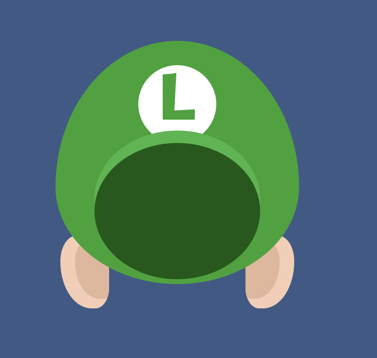
Luigi's Ears CSS
Luigi's ears are ovals with specific border-radius's on either side. The side of the ear closest to the face is less rounded while the outside of the ear is more rounded. We can use the border-radius shorthand to define each corner of the oval to create this shape as shown below.
1.<div class="Luigi">2. <div class="Luigi__ear Luigi__ear--left"></div>3. <div class="Luigi__ear Luigi__ear--right"></div>4. ...5.</div>
1..Luigi__ear {2. background: #f8ccb3;3. width: 50px;4. height: 75px;5. left: 80px;6. top: 200px;7. position: absolute;8. border-radius: 50% 40% 40% 90%;9. overflow: hidden;10. }11..Luigi__ear--right {12. left: 270px;13. border-radius: 40% 50% 90% 40%;14. }15.16..Luigi__ear--left::after {17. content: "";18. height: 60px;19. width: 40px;20. background: #e5b69b;21. position: absolute;22. right: -5px;23. top: 5px;24. border-radius: 50% 40% 40% 90%;25. }26.27..Luigi__ear--right::after {28. content: "";29. height: 60px;30. width: 40px;31. background: #e5b69b;32. position: absolute;33. left: -5px;34. top: 5px;35. border-radius: 40% 50% 90% 40%;36.}
Luigi's Face CSS
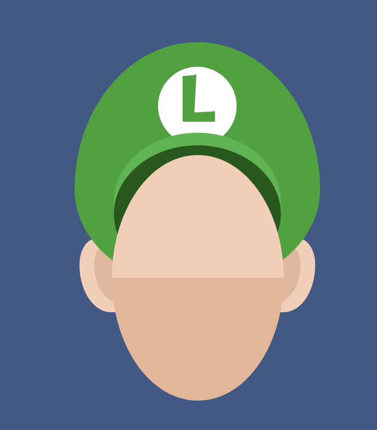
Hopefully, at this point, you've realized that I'm probably going to use an oval with border-radius to create Luigi's face, in which case, you're absolutely right. We can create the five-o-clock shadow by adding a vertical linear-gradient that does not blend.
1.<div class="Luigi">2. ...3. <div class="Luigi__face"></div>4.</div>
1..Luigi__face {2. background-image: linear-gradient(to bottom, #f8ccb3 50%, #ecb494 50%);3. height: 250px;4. width: 175px;5. position: absolute;6. top: 115px;7. left: calc(50% - 87.5px);8. border-radius: 100%;9. z-index: 1;10.}
Luigi's Eyebrows CSS
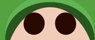
Luigi's eyebrows are essentially fat arcs that taper off on the side very quickly. We can create this effect in CSS by first creating a regular circle in CSS:
Then creating another circle that overlaps the first circle:
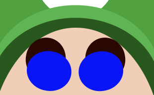
Then changing the overlapping circle to match the color of the background to create the illusion of "cutting out" the original circle:

The second circle that overlaps the first is created with the ::after pseudo-element, but you could easily just create another full element.
1.<div class="Luigi__eyebrow"></div>2.<div class="Luigi__eyebrow Luigi__eyebrow--right"></div>
1..Luigi__eyebrow {2. width: 40px;3. height: 43px;4. border-radius: 100%;5. background: #2e0400;6. position: absolute;7. left: 37px;8. top: 10px;9. transform: rotate(10deg);10. }11..Luigi__eyebrow::after {12. content: "";13. background: #f8ccb3;14. position: absolute;15. bottom: -10px;16. left: 3px;17. height: 40px;18. width: 45px;19. border-radius: 100%;20. }21..Luigi__eyebrow--right {22. left: 97px;23. transform: rotate(-10deg);24. }25..Luigi__eyebrow--right::after {26. right: 4px;27. left: auto;28.}
Luigi Eyes CSS
The eyes are really just nested ovals (see a pattern yet?) with different colors at specific positions.
1.<div class="Luigi__eye">2. <div class="Luigi__iris">3. <div class="Luigi__pupil"></div>4. </div>5. </div>6. <div class="Luigi__eye Luigi__eye--right">7. <div class="Luigi__iris Luigi__iris--right ">8. <div class="Luigi__pupil Luigi__pupil--right"></div>9. </div>10.</div>
1..Luigi__eye {2. background: white;3. height: 70px;4. width: 45px;5. border-radius: 100%;6. position: absolute;7. left: 35px;8. top: 40px;9. overflow: hidden;10. z-index: 2;11.}12..Luigi__eye--right {13. left: 95px;14.}15..Luigi__iris {16. width: 35px;17. height: 55px;18. background: #2ba7d1;19. border-radius: 100%;20. right: -2px;21. bottom: 7px;22. position: absolute;23.}24.25..Luigi__iris--right {26. left: -2px;27. right: auto;28.}29.30..Luigi__pupil {31. width: 23px;32. height: 40px;33. background: black;34. border-radius: 100%;35. right: 4px;36. bottom: 7px;37. position: absolute;38. }39..Luigi__pupil::before {40. content: "";41. position: absolute;42. background: white;43. height: 10px;44. width: 10px;45. border-radius: 100%;46. left: 5px;47. top: 5px;48. }49..Luigi__pupil--right {50. right: auto;51. left: 4px;52.}

Luigi's Nose CSS
Luigi's nose, like most other elements in this image, is an oval with slightly different border-radius values for each side. Position the nose over the eyes to create some depth as well.
1.<div class="Luigi">2. ...3. <div class="Luigi__nose"></div>4. ...5.</div>
1..Luigi__nose {2. width: 84px;3. height: 84px;4. border-radius: 50% 50% 60% 60%;5. background: #f6b996;6. position: absolute;7. left: calc(50% - 42px);8. top: 86px;9. z-index: 3;10.}
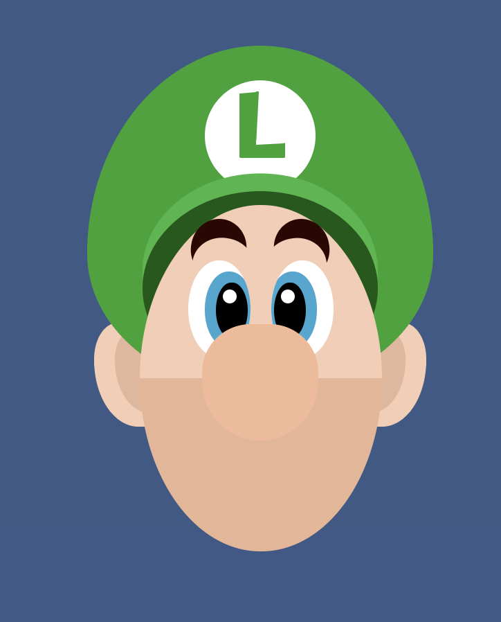
Luigi's Mustache CSS
We've come to the most important part of the face: the mustache. The mustache really brings the whole image together so it's important to get right. We're going to start with an oval:
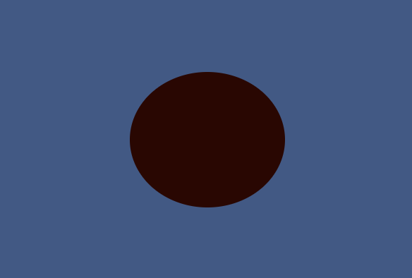
Then we're going to create two more large ovals on either side of the main oval using multiple box-shadows, check out the image to see the placement.
1.box-shadow: -2.25em 1em 0 red, 2.25em 1em 0 blue;
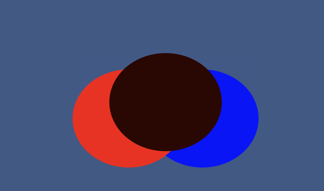
The blue and red colors are just placeholders so you can distinguish the shapes better. Next, we're going to create another oval that spans across all three ovals on the top. This oval will have the same color as Luigi's skin, while the two box-shadow`` ovals should be changed to the color of the mustache.
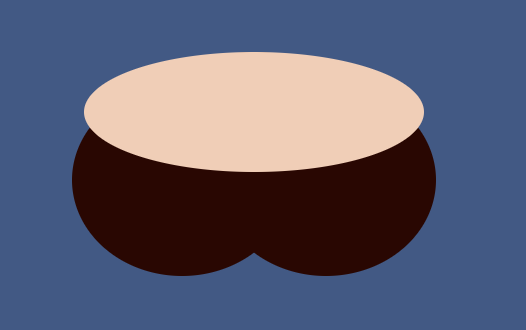
The top oval will blend in with Luigi's skin on either side of his nose to give the illusion of cutting away the ovals, similar to his eyebrows. Finally, we need to place the mustache under his nose but above his chin.
1.<div class="Luigi__mustache"></div>
1..Luigi__mustache {2. position: absolute;3. top: 73px;4. left: calc(50% - 55px);5. height: 96px;6. width: 110px;7. border-radius: 50%;8. background: #2e0400;9. box-shadow: -2.25em 1em 0 #2e0400, 2.25em 1em 0 #2e0400;10.}11.12..Luigi__mustache::after {13. content: "";14. position: absolute;15. top: 0em;16. left: calc(50% - 85px);17. height: 60px;18. width: 170px;19. border-radius: 50%;20. background: #f8ccb3;21.}
If you liked this CSS demo, you also might like Draw and Animate Bender's Face with CSS or Animate Octocat swimming with CSS.
