The Scranton Times Newspaper with CSS Grid
April 17, 2020
Newspapers are a great way to practice creating layouts with CSS Grid because their layouts are separated so distinctly into columns and rows. Below is a recreation of The Scranton Times newspaper from the Office created by Etsy user datemike1. The title and quotes are from season 3 episode 20, "Product Recall", where Michael holds a press conference with a reporter, Chad Light, from The Scranton Times. Earlier in the episode, Michael pitches the crazy long article headline.
Convention banner
The banner is one of the more complicated objects to create due to its unique shapes. Essentially, there are 3 main parts: the center rectangle, left and right rectangles, and the connecting pieces between those two.

The connecting pieces, highlighted as 3, are right triangles with a darker shade of red to give the illusion of a shadow.
Scranton Times title
The newspaper's title is using the UnifrakturCook font, which does not match the font in the original very well. As far as I could tell, the original is using a paid font that I could not find a free alternative to that looked as good so I went with the best font on Google Fonts.
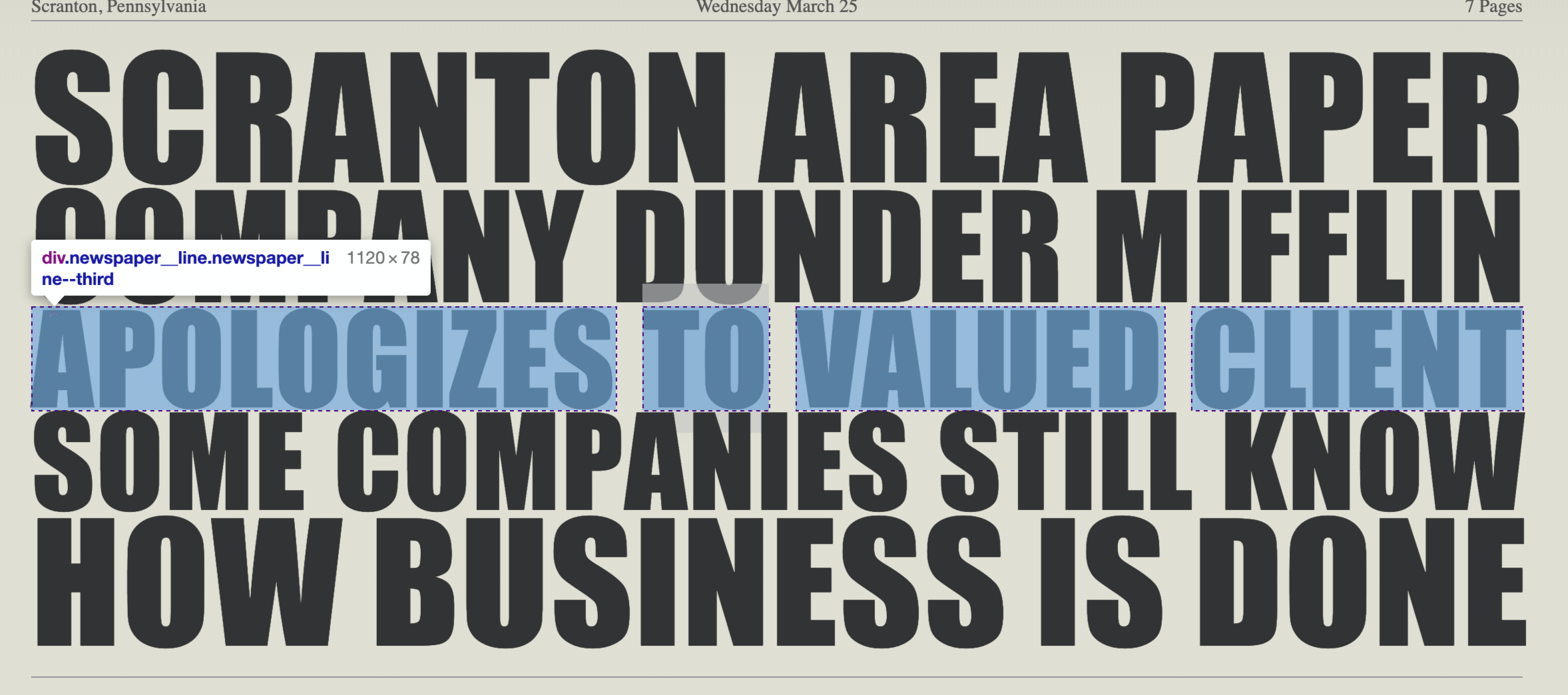
Main article title
The title's font is Impact, which makes the long title stand out so much more. Getting each line to line up was a challenge because each line has a different font-size. I ended up using CSS Grid to keep the required number of words per line, then played around with the font-size until each lined up how it should.
Main grid
The layout is broken into 5 columns of equal width with a column-gap of 20px. The image and quote span the middle three columns. There's several ways that this can be accomplished with CSS Grid, but I went with a nested grid where the main grid is three columns. The left and right columns are the same widths, while the middle column spans three columns including the gaps.
1..newspaper__grid {2. display: grid;3. grid-template-columns: 208px 1fr 208px;4. grid-gap: 20px;5.}
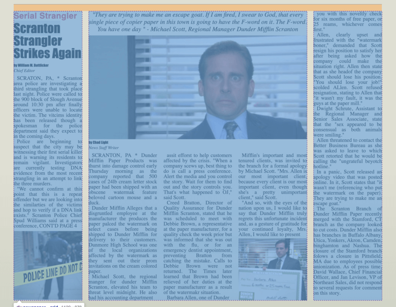
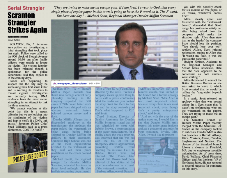
The middle column, within the main grid, is also a grid with three columns. Each of these sub columns has the same width.
1..newspaper__threecolumn {2. display: grid;3. grid-template-columns: repeat(3, 208px);4. grid-gap: 20px;5.}
Bottom Grid
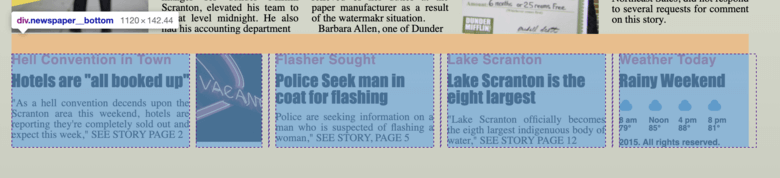
The bottom grid is made up of 8 columns with different widths. The 1px columns are the divider lines. This certainly isn't the only way to achieve this effect, but it shows how flexible a grid layout can be.
1..newspaper__bottom {2. display: grid;3. grid-template-columns: 270px 100px 1px 240px 1px 240px 1px 208px;4. grid-gap: 10px;5.}
Conclusion
CSS Grid allows us to create complex layouts with just a few lines of CSS, which, in many cases, is dramatically simpler than previous CSS methods.
You Might Also Like
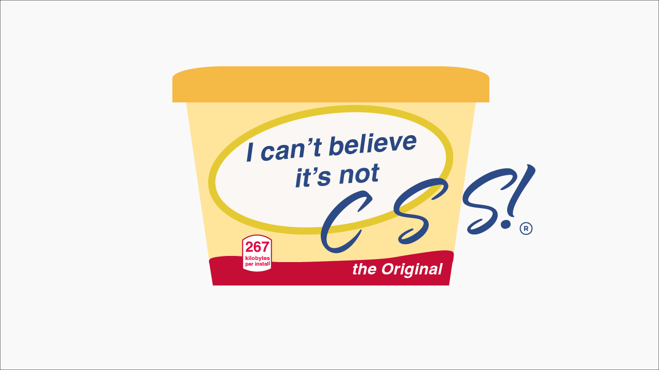
I Can't Believe It's Not CSS: Styling Websites with SQL
Style websites using SQL instead of CSS. Database migrations for your styles. Because CSS is the wrong kind of declarative.
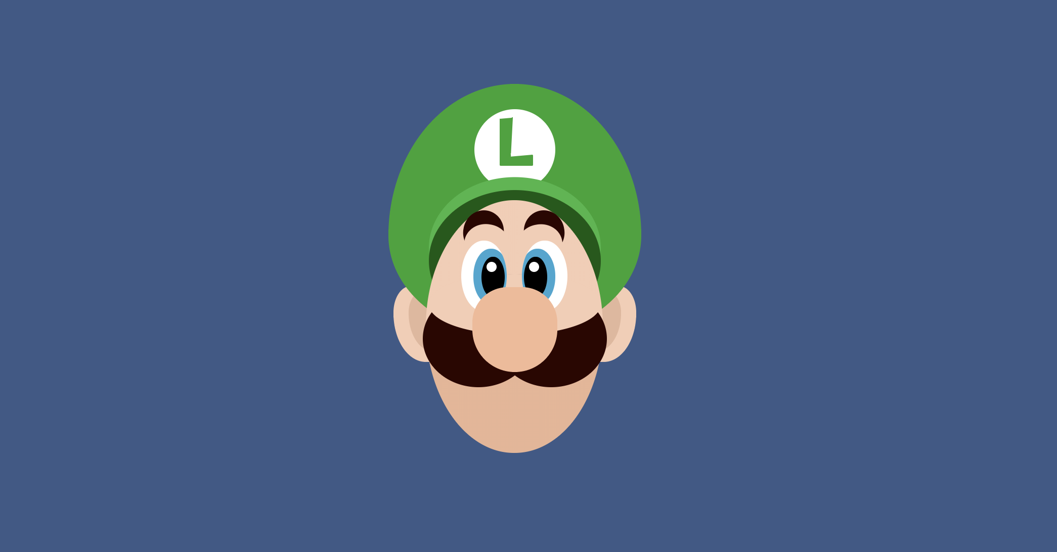
Luigi CSS
Luigi from Super Mario recreated in CSS

Create Animated Loading Text with CSS
An example of animating text up and down like a wave as a loading animation