Create Animated Loading Text with CSS
April 03, 2020
Loading animations are a great way to give visual feedback when a user is waiting for some action to finish. In this tutorial, we will learn one method of animating text up and down like a wave to act as a loading animation.
HTML and CSS Setup
If we were animating the text as a group, then we could put all of the letters in one element. But this animation requires that each letter animates separately, therefore we need to separate each letter into its own element.
1.<div class="container">2. <div class="loading">3. <div class="loading__letter">L</div>4. <div class="loading__letter">o</div>5. <div class="loading__letter">a</div>6. <div class="loading__letter">d</div>7. <div class="loading__letter">i</div>8. <div class="loading__letter">n</div>9. <div class="loading__letter">g</div>10. <div class="loading__letter">.</div>11. <div class="loading__letter">.</div>12. <div class="loading__letter">.</div>13. </div>14.</div>
The container class will center the text on the page and define the background color. The loading class uses flex-direction: row to force the loading_letter elements to render as a row.
1..container {2. height: 100vh;3. background: #773d8c;4. display: flex;5. justify-content: center;6. align-items: center;7.}8.9..loading {10. display: flex;11. flex-direction: row;12.}
Finally, define some basic styling for the text. The font Audiowide can be sourced from Google Fonts.
1.@import url(https://fonts.googleapis.com/css?family=Audiowide);2.3..loading__letter {4. font-size: 88px;5. font-weight: normal;6. letter-spacing: 4px;7. text-transform: uppercase;8. font-family: "Audiowide";9. color: #fec468;10.}
Loading Text Animation
The @keyframe animation uses the translateY transform function to move each letter up 40 pixels and then back down to 0 pixels. We could define the peak of the animation at 50%, or half-way through the animation, but defining the peak a little earlier (40%) and finishing the animation a little earlier (80%) means there will be a small pause in between each iteration.
1.@keyframes bounce {2. 0% {3. transform: translateY(0px);4. }5. 40% {6. transform: translateY(-40px);7. }8. 80%,9. 100% {10. transform: translateY(0px);11. }12.}
Update the .loading_letter class with the animation-name set to bounce, animation-duration set to 2s, and the animation-iteration-count to infinite.
1..loading__letter {2. font-size: 88px;3. font-weight: normal;4. letter-spacing: 4px;5. text-transform: uppercase;6. animation-name: bounce;7. animation-duration: 2s;8. animation-iteration-count: infinite;9.}
Since we're adding the exact same animation to each letter, with the exact same timing, the letters will animate as a group:
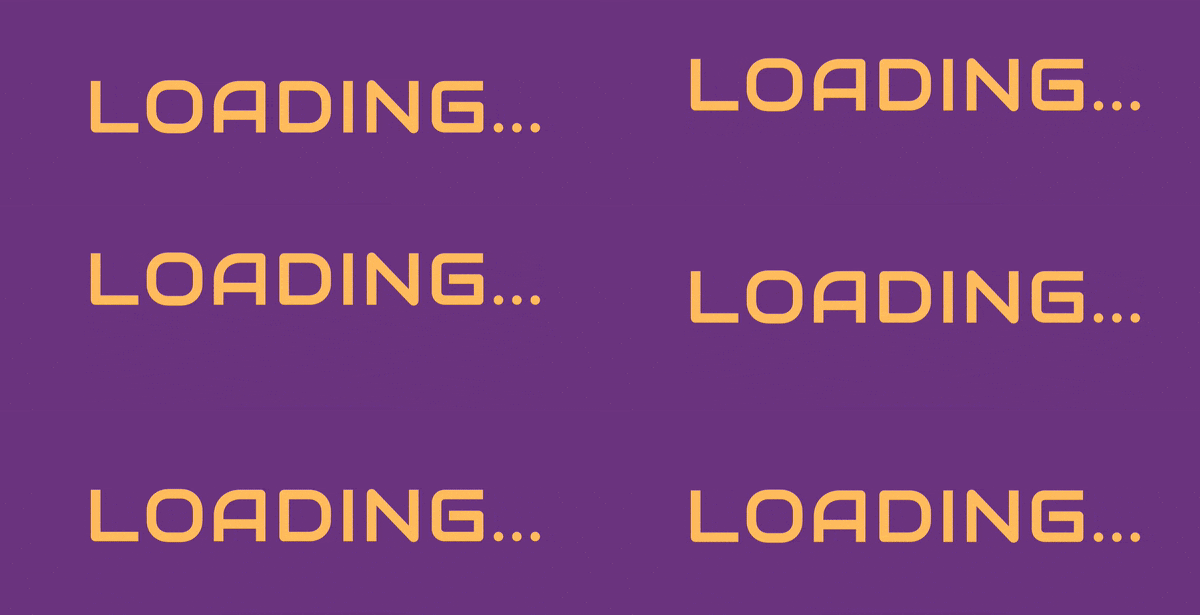
To create the wave animation we need to animate the letters one after each other, or sequentially. We can do this in CSS by adding an increasing the animation-delay for each letter in equal increments. The first letter will start immediately, the second letter will be delayed 0.1 seconds, the third letter 0.2 seconds, and so forth. Finally, we can select each letter in CSS using the nth-child(num) pseudo-class by passing in the position.
1..loading__letter:nth-child(2) {2. animation-delay: 0.1s;3.}4..loading__letter:nth-child(3) {5. animation-delay: 0.2s;6.}7..loading__letter:nth-child(4) {8. animation-delay: 0.3s;9.}10..loading__letter:nth-child(5) {11. animation-delay: 0.4s;12.}13..loading__letter:nth-child(6) {14. animation-delay: 0.5s;15.}16..loading__letter:nth-child(7) {17. animation-delay: 0.6s;18.}19..loading__letter:nth-child(8) {20. animation-delay: 0.8s;21.}22..loading__letter:nth-child(9) {23. animation-delay: 1s;24.}25..loading__letter:nth-child(10) {26. animation-delay: 1.2s;27.}
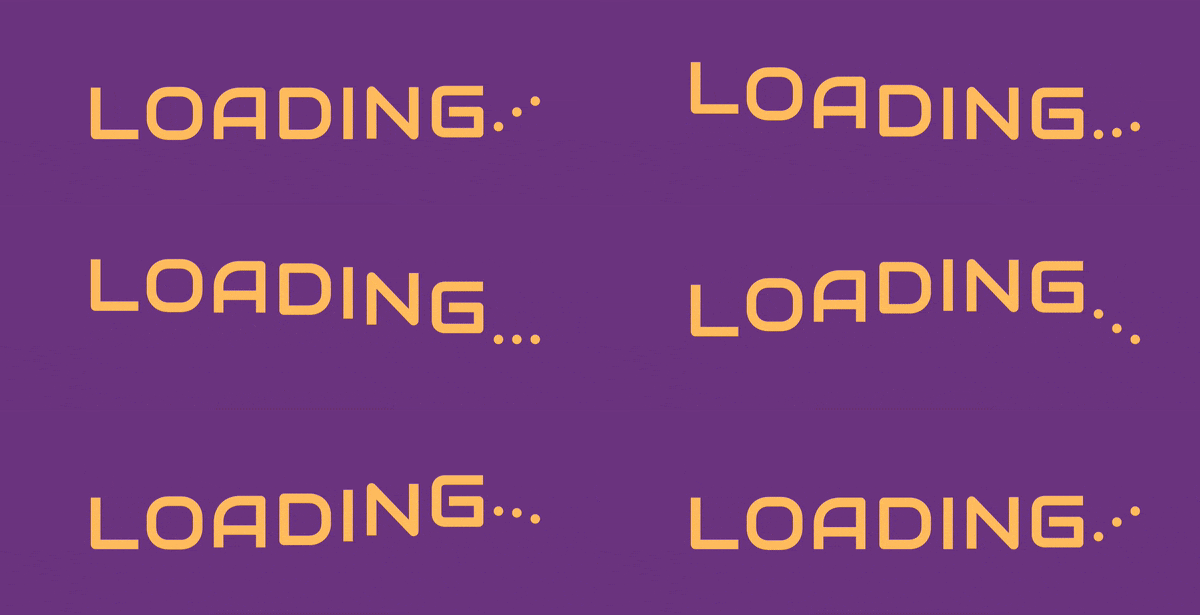
Try playing around with different delay increments, or try a different animation-timing-function like ease-in-out and see how it affects the animation.
