Draw and Animate Bender's Face with CSS
January 23, 2020
Futurama's lively characters and simple animation can easily be recreated with CSS using basic shapes. Bender, specifically, is drawn almost completely with basic shapes. This tutorial will demonstrate how to create Bender's face with CSS and animate his eyelids to make it seem like he's squinting. Check out the completed project on Codepen.
Container and Color
First, let's create a container and define the background. The hex color `#a6b4c4` matches Bender's metal color pretty well, but we can give the illusion (sort of) of shininess by creating a radial gradient with the hex color #59798e.

1.<div class="Bender"></div>
1.body {2. overflow: hidden;3. padding: 0;4. margin: 0;5. }6..Bender {7. height: 100vh;8. width: 100vw;9. display: flex;10. justify-content: center;11. align-items: center;12. flex-direction: column;13. background: #a6b4c4;14. background-image: radial-gradient(#a6b4c4, #59798e);15.}
Eyes
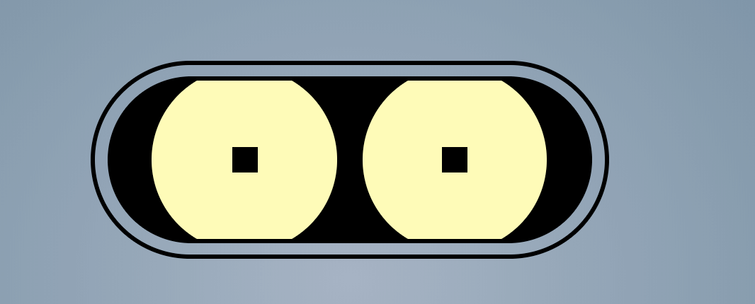
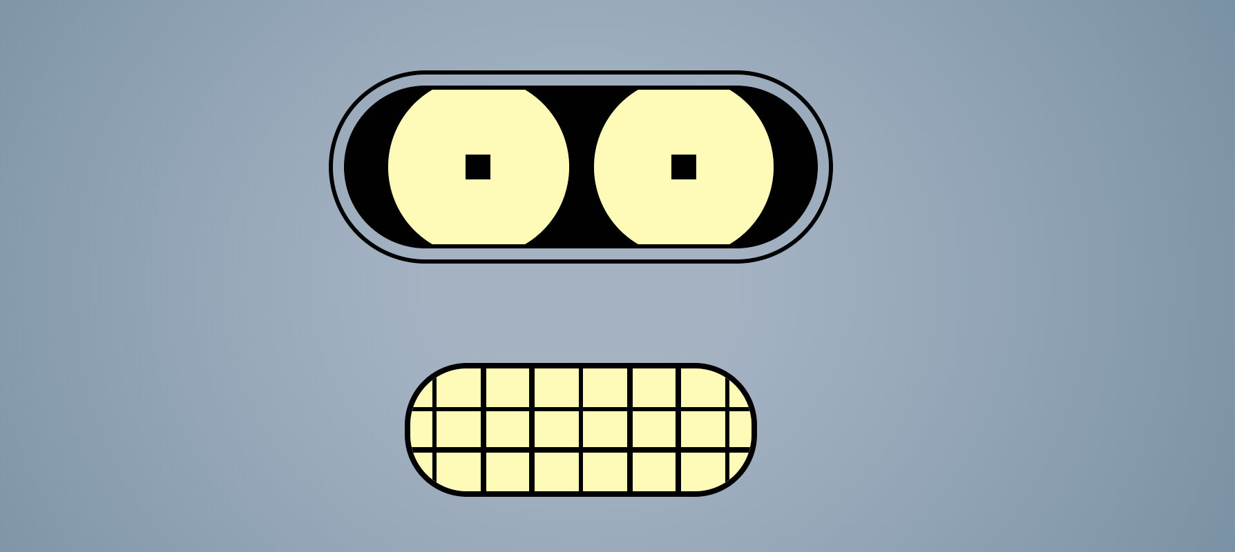
Drawing with CSS is a lot easier when we can break images down into simple shapes that are easily created with CSS. Bender's eyes, for example, can be broken into three basic shapes: ellipses, circles, and squares
.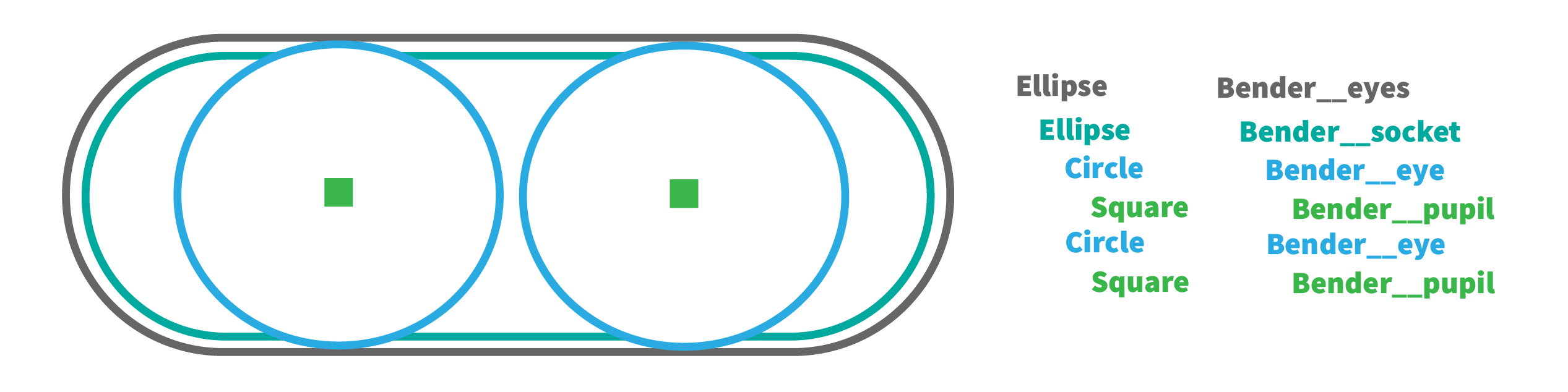
The outer rim is composed of the space between the Beneder_eyes border and the Bender__socket element. The eye elements, Bender_eye, have a larger height than the Bender_socket element so that we can clip the top and bottom parts of the eye to create the illusion that the eyes are nested inside the socket. Add the following HTML elements and CSS to create the eyes.
1.<div class="Bender">2.<div class="Bender__eyes">3. <div class="Bender__socket">4. <div class="Bender__eye">5. <div class="Bender__pupil"></div>6. </div>7. <div class="Bender__eye">8. <div class="Bender__pupil"></div>9. </div>10. </div>11.</div>12.</div>
1..Bender__eyes {2. width: 400px;3. height: 150px;4. border: 3px solid black;5. border-radius: 200px;6. position: relative;7. display: flex;8. justify-content: center;9. align-items: center;10.}11.12..Bender__socket {13. width: 375px;14. height: 125px;15. border: 3px solid black;16. border-radius: 200px;17. background: black;18. display: flex;19. justify-content: center;20. overflow: hidden;21.}22.23..Bender__eye {24. height: 145px;25. width: 145px;26. background: #fefbb8;27. border-radius: 100%;28. margin: -10px 10px 0px 10px;29. display: flex;30. align-items: center;31. justify-content: center;32. position: relative;33.}34..Bender__pupil {35. width: 20px;36. height: 20px;37. background: black;38.}
Mouth
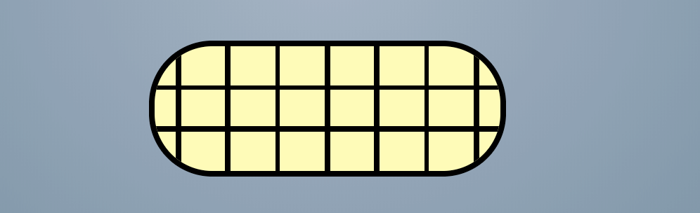
Bender's mouth is essentially an ellipse with two horizontal lines and few vertical lines. We can space seven, 4px width, vertical lines across the Bender__mouth ellipse using flexbox and justify-content: space-around. The two horizontal lines are a little more difficult to place since they're not evenly spaced from the top or middle. But we can use absolute position and the calc() function to place them exactly where we want.
1.<div class="Bender">2. ...3. <div class="Bender__mouth">4. <div class="Bender__tooth"></div>5. <div class="Bender__tooth"></div>6. <div class="Bender__tooth"></div>7. <div class="Bender__tooth"></div>8. <div class="Bender__tooth"></div>9. <div class="Bender__tooth"></div>10. <div class="Bender__tooth"></div>11.12. <div class="Bender__lip"></div>13. <div class="Bender__lip"></div>14. </div>15.</div>
1..Bender__mouth {2. width: 275px;3. height: 100px;4. background: #fefbb8;5. margin-top: 80px;6. border-radius: 50px;7. border: 4px solid black;8. display: flex;9. align-items: center;10. justify-content: space-around;11. overflow: hidden;12. position: relative;13.}14..Bender__tooth {15. height: 100px;16. width: 4px;17. background: black;18.}19..Bender__lip {20. position: absolute;21. width: 275px;22. height: 4px;23. background: black;24. top: calc(33% - 2px);25.}26..Bender__lip:last-of-type {27. top: calc(66% - 2px);28.}
Animate the Eyes
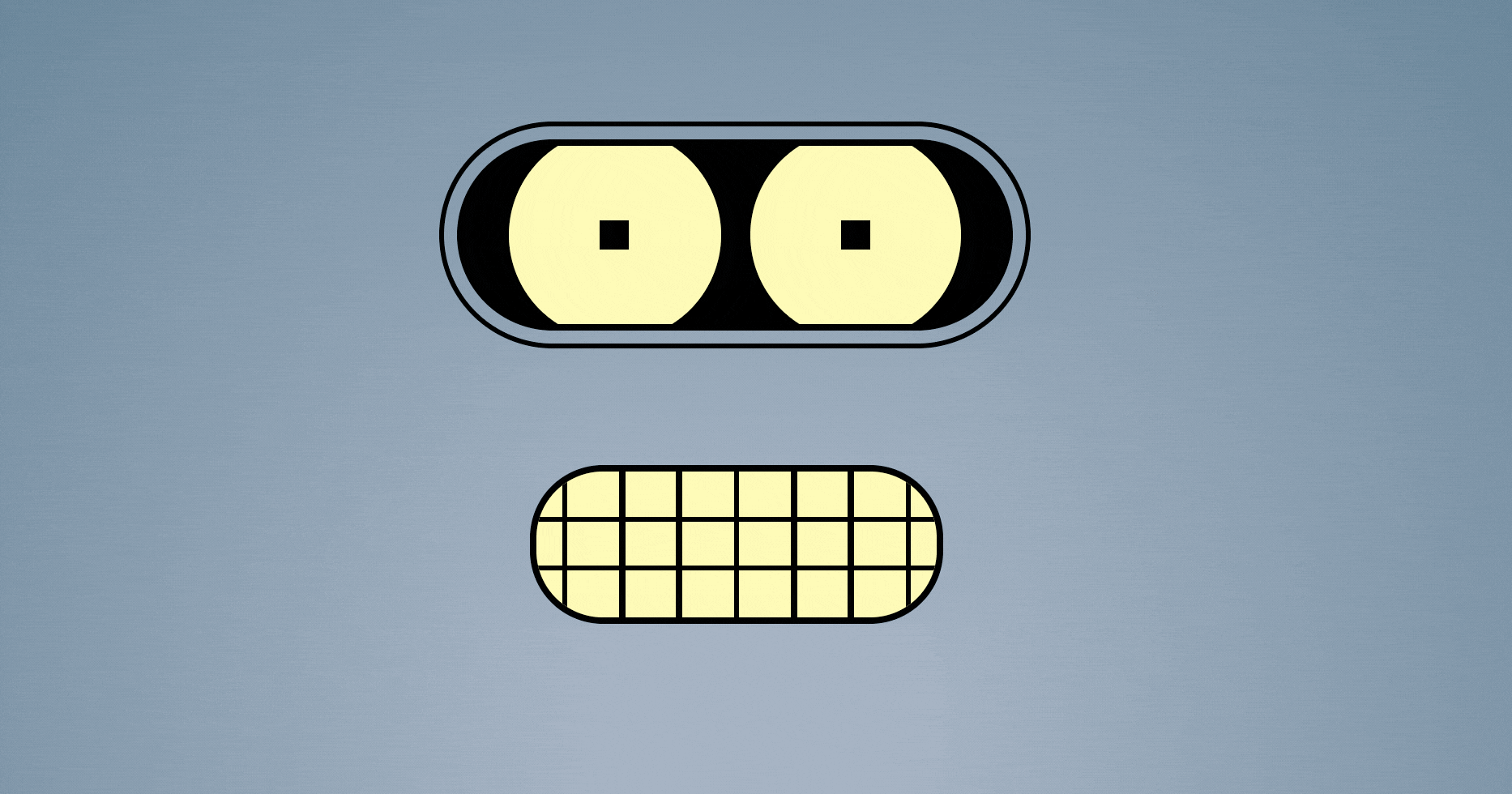
We can animate Bender squinting his eyes, like he's skeptical or angry, by animating eyelids up and down over his eyes. We could create separate components for his eyelids, but in this case, we will use the ::before and ::after pseudo elements to create the top and bottom eyelid respectively. Using position: absolute, set the eyelids directly above the eyes as shown in the image below.
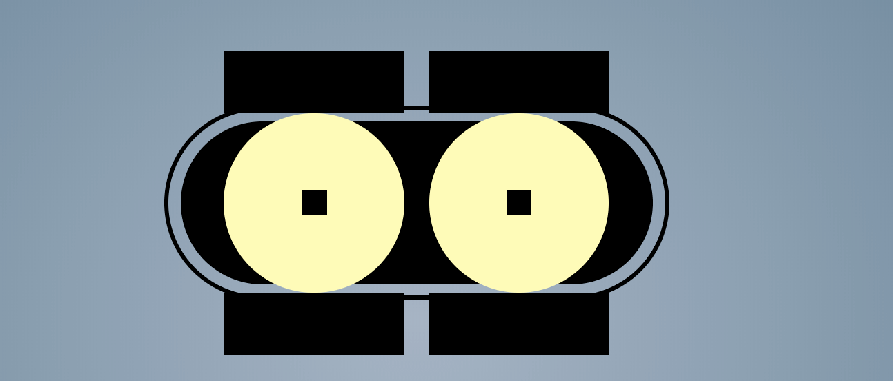
These will be hidden, however, by the Bender__socket element which has overflow: hidden.
1..Bender__eye::before {2. content: "";3. position: absolute;4. width: 145px;5. height: 50px;6. top: -50px;7. background: black;8.}9..Bender__eye::after {10. content: "";11. position: absolute;12. width: 145px;13. height: 50px;14. bottom: -50px;15. background: black;16.}
The goal is to animate the top eyelid down and bottom eyelid up to give the illusion that the eyelids are closing over the eye. We can do this by adding a transform that translates the eyelids along the Y axis, for example transform: translateY(-50px). Since we defined the top eyelid to be -50px above the eye, we need to start at that position, translateY(0px), and animate back down to the near the pupil, translateY(50px). The bottom eyelid needs to go in the opposite direction translateY(-50px). Define two @keyframes that go from 0% to 100% for both the top and bottom eyelids.
1.@keyframes topEyelid {2. 0% {3. transform: translateY(0px);4. }5. 100% {6. transform: translateY(50px);7. }8. }9.@keyframes bottomEyelid {10. 0% {11. transform: translateY(0px);12. }13. 100% {14. transform: translateY(-50px);15. }16.}
Next, add the animation property to each eyelid with the appropriate keyframe name at the end.
1..Bender__eye::before {2. animation: 5s ease-in-out 1s infinite topEyelid;3. }4..Bender__eye::after {5. animation: 5s ease-in-out 1s infinite bottomEyelid;6.}
One problem with this animation is that it ends abruptly and resets the eyelids to their initial positions instead of animating them back. We can make this animation more natural by breaking the animation keyframes into more parts.
First, we get to the end animation more quickly by animating from 0% to 20%. Then we can hold that position by defining the same transform until 80%. Finally, we can return to the starting position at 100%. This means that the start of the animation 0% and the end 100% are at the same spot so the eyelid will animate away from the starting position and animate back to the starting position.
1.@keyframes topEyelid {2. 0% {3. transform: translateY(0);4. }5. 20% {6. transform: translateY(50px);7. }8. 80% {9. transform: translateY(50px);10. }11. 100% {12. transform: translateY(0px);13. }14.}15.16.@keyframes bottomEyelid {17. 0% {18. transform: translateY(0px);19. }20. 20% {21. transform: translateY(-50px);22. }23. 80% {24. transform: translateY(-50px);25. }26. 100% {27. transform: translateY(0px);28. }29.}
Now we have a much more natural animation.
Conclusion
There are probably half a dozen different ways to create Bender with CSS, but I hope this version helps you see how easy drawing with CSS can be.