10 Awesome World Government Design Systems and UI Kits
January 10, 2020
Design systems are taking over the world. More and more tech companies, in the last few years, are creating visual design systems to unify their brand across all their products. For example, Google's Material Design, AirBnB Design, and Microsoft's Fluent provide style guides, icon packages, and UI kits that help designers and developers achieve visual consistency between services and teams.
World governments are now joining this trend to unify their national brand across all their online services and applications. Some countries even open source their components and design language, and allow users to download their assets. Other countries, like Estonia, seem to be use their design system to express their national identity in a similar way to flags and currency. Below are ten examples of excellent world government design systems with links to their documentation, Github, and components if available.
1. Argentina - Poncho
Documentation - Poncho Github - NPM
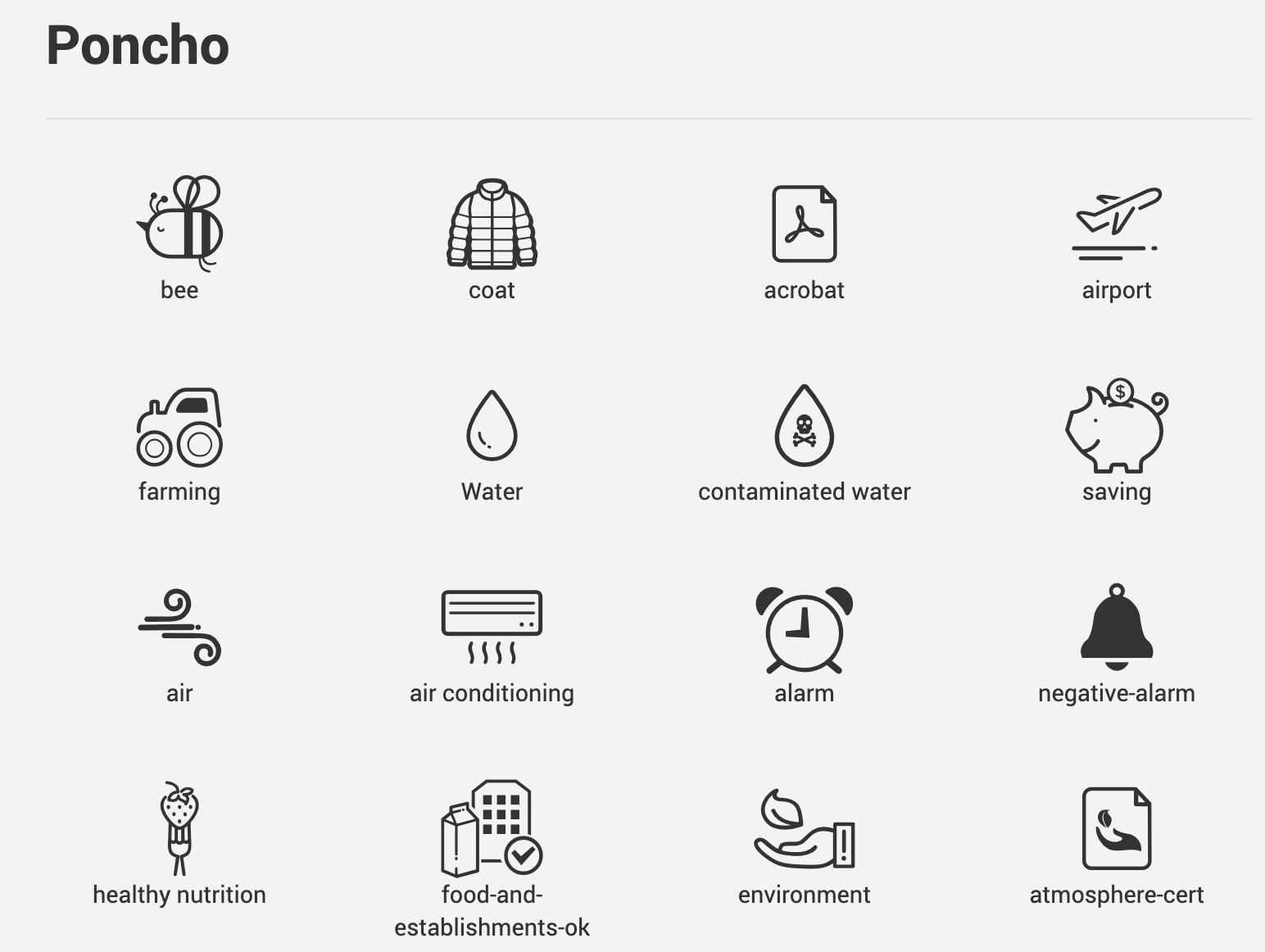
Poncho is a design system and set of UI components for Government of the Republic of Argentina. The system is based off of Bootstrap and uses Roboto as the main font. Although they make use of Font Awesome, Poncho also provides a large set of custom icons:
They also have an amazing pixel art logo/mascot:

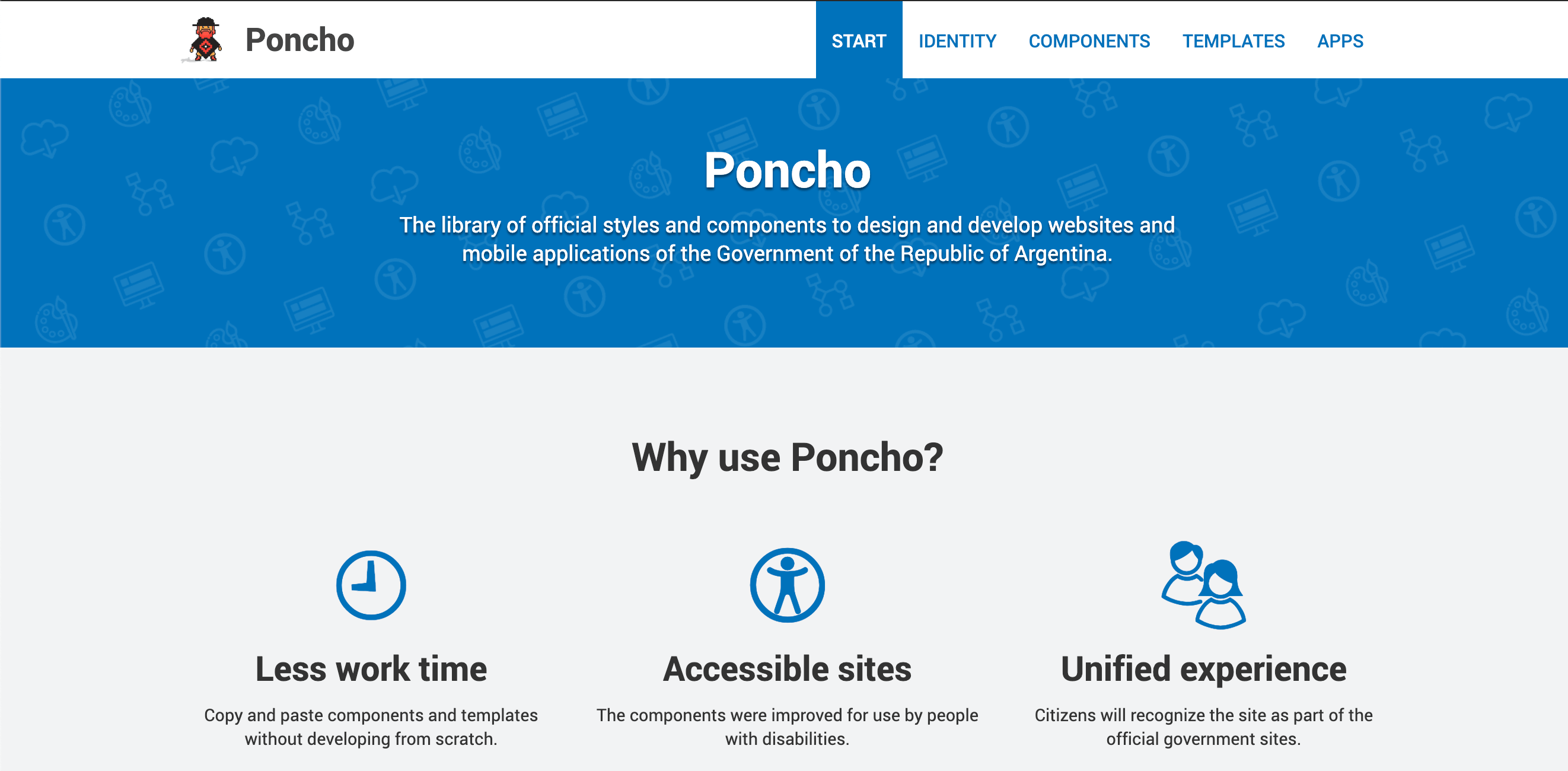
2. Australia - Australian Government Design System
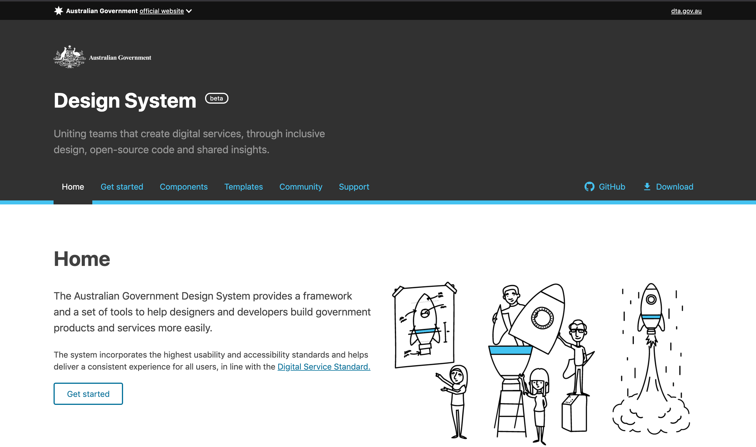
Documentation - Design System Components Github - NPM
The Australian Government Design System contains a set of 30 UI components built with SASS and 3 premade templates. Their excellent documentation provides live examples of each component along with easy to copy snippets of SCSS, HTML, and React. Design assets for Sketch are also available
3. Canada - Aurora Design System
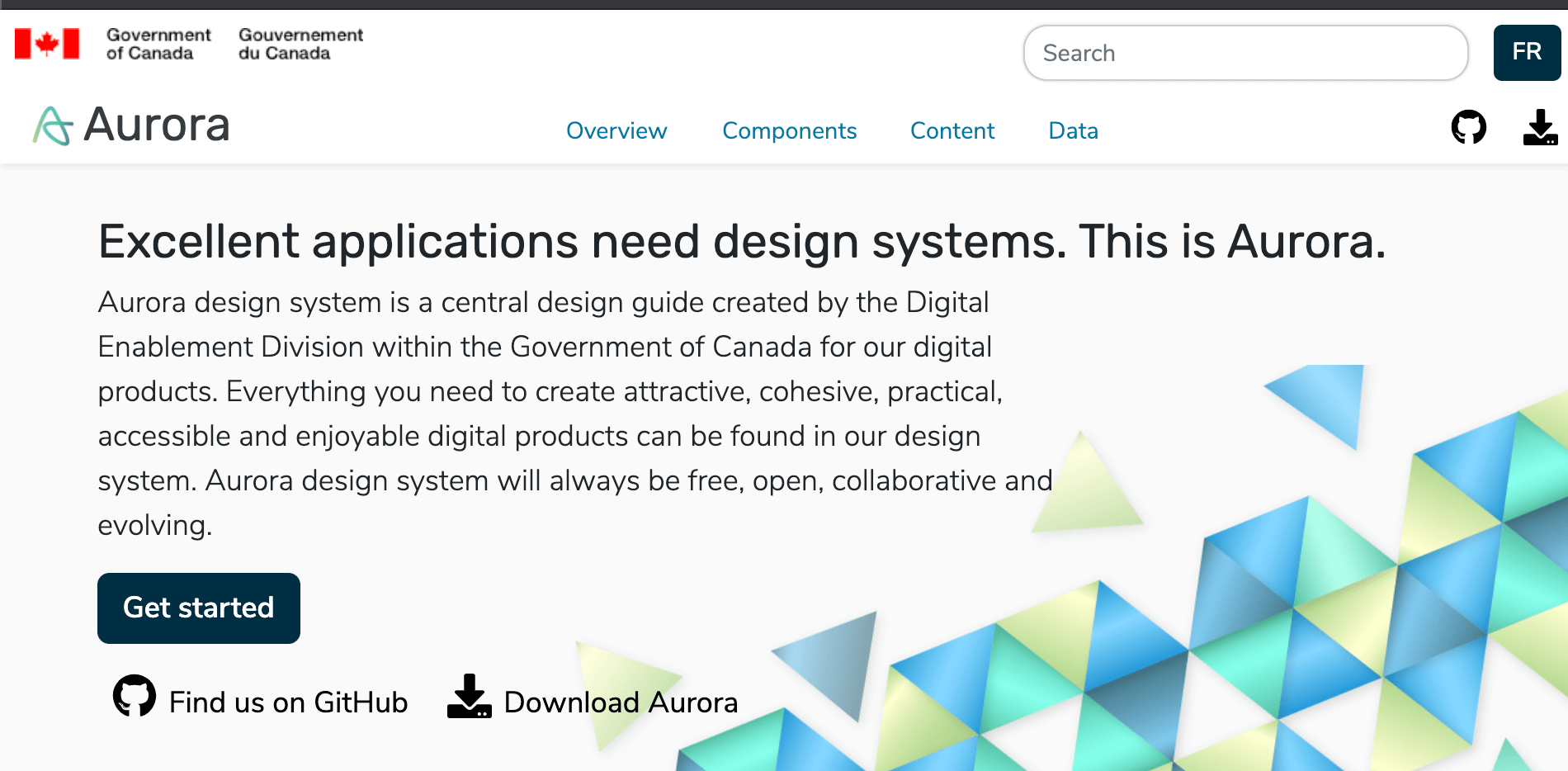
Documentation - Aurora Components Github
Aurora is a design system, set of UI components, and style guide for the Canadian Government. The documentation provides live examples, HTML snippets, as well as advice on best practices for designers. Uniquely, they have 8 pages of advice for data visualization. Aurora also provides some neat color themes that work well with their components, including Aurora Borealis, Thunder and Lightning, and Triad.
4. Estonia - Brand
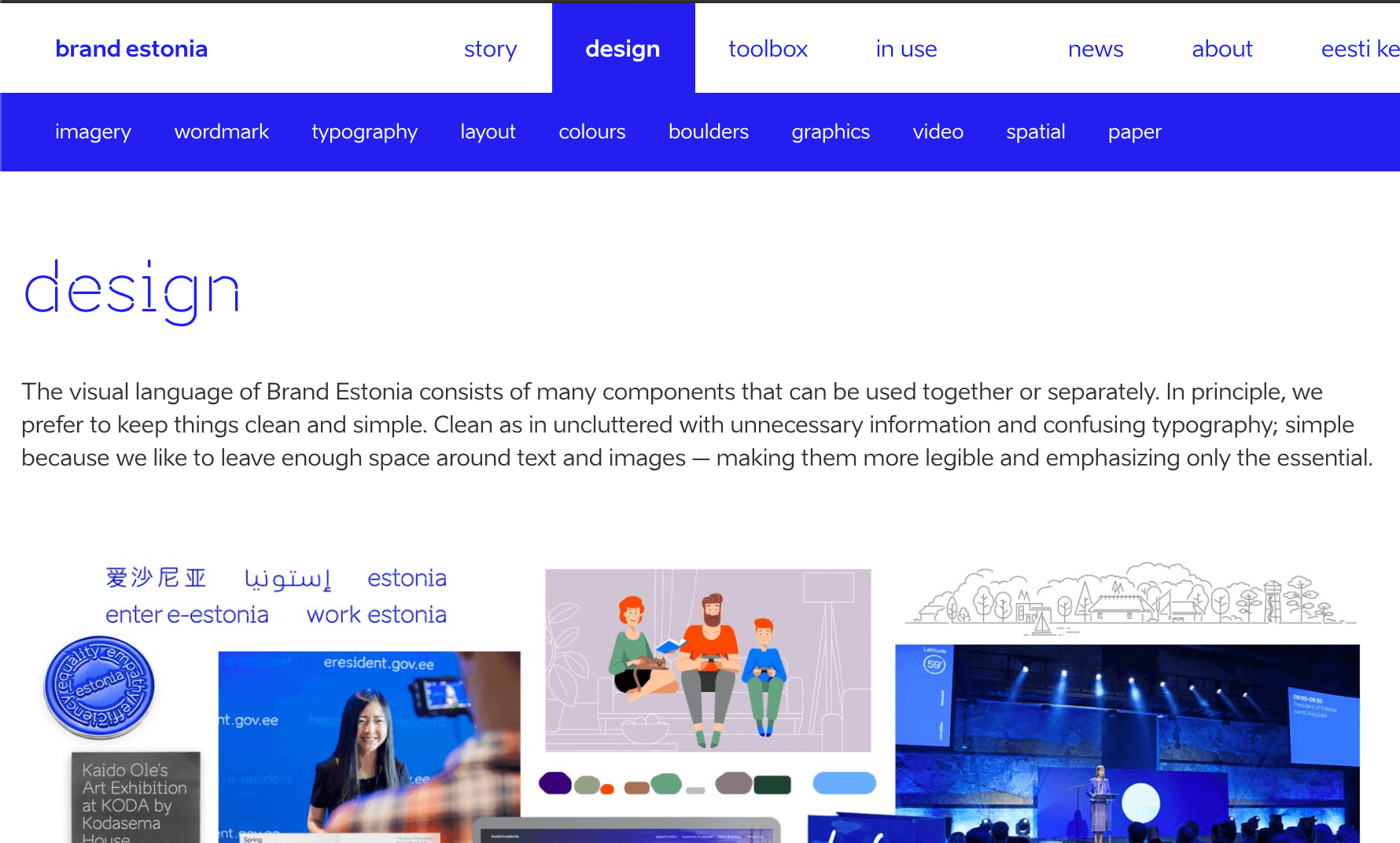 Brand Website
The Estonia design system unifies the Estonia brand across the web. Unlike some of the other government design systems, the CSS components do not appear to be open source. However, the design kits for components are available for download as pdfs and as ais for Adobe Illustrator. Additionally, illustrations, icons, animated icons, and other design assets are available for download.
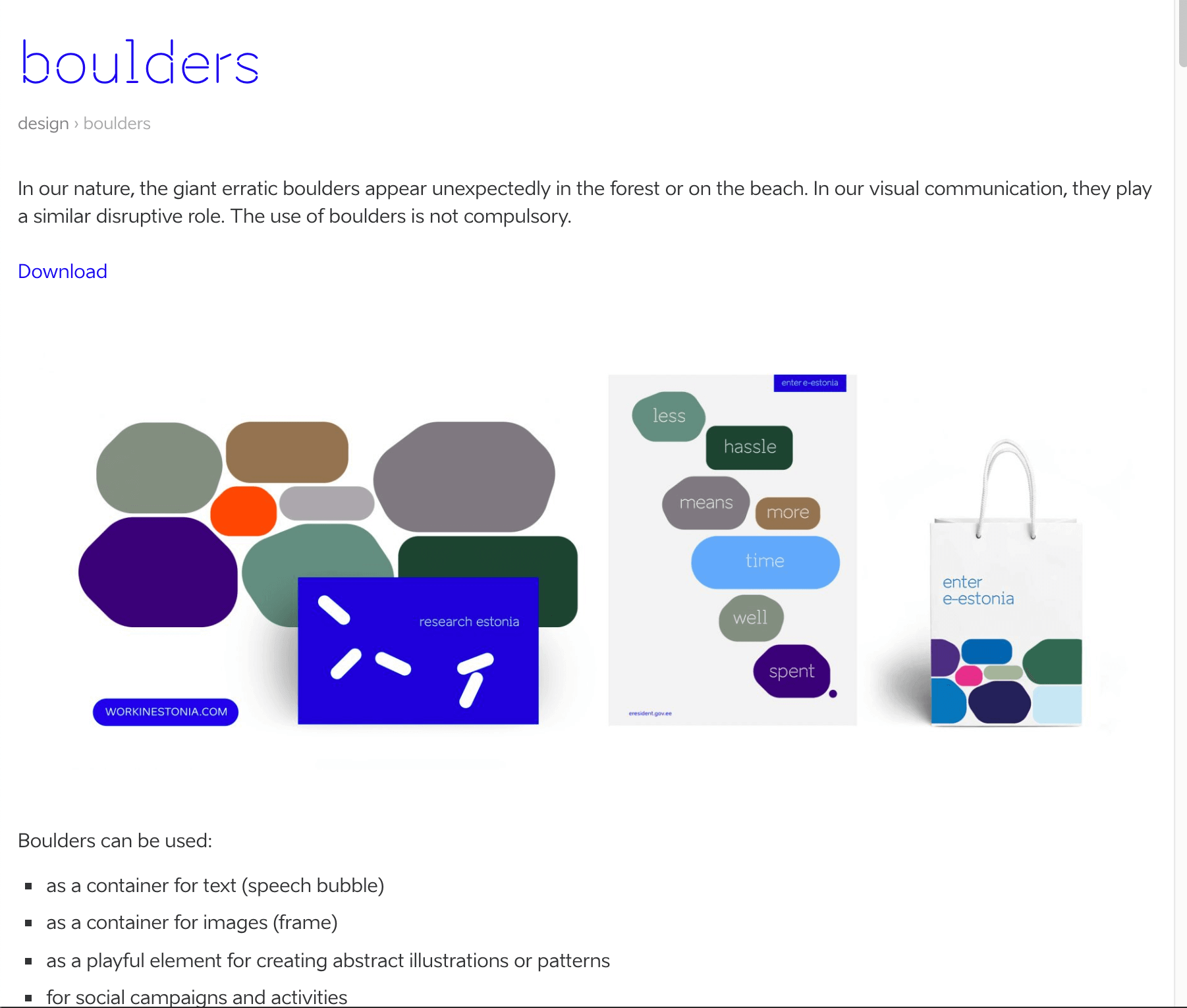
Estonia design has a lot of interesting aspects, chief among them, these awesome Boulder components.
5. Italy - Italian Design System
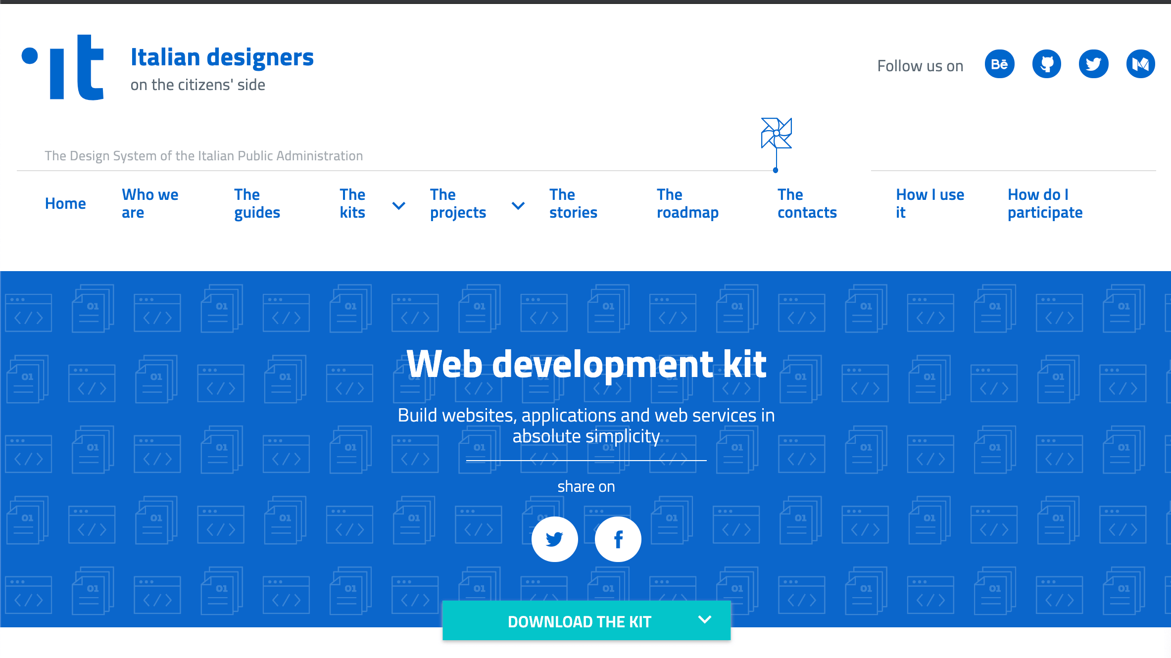 Italy Design
The Italian Design system is one of the most extensive government design systems on this list. For starters, there are guidelines for usability, analytics, accessibility, UI principles, service design principles, information architecture, and so on. There are kits for A/B testing, wireframes, SEO, web development, user stories, and so much more. Additionally, they have a Medium blog, Behance account, twitter account,and a dedicated forum.
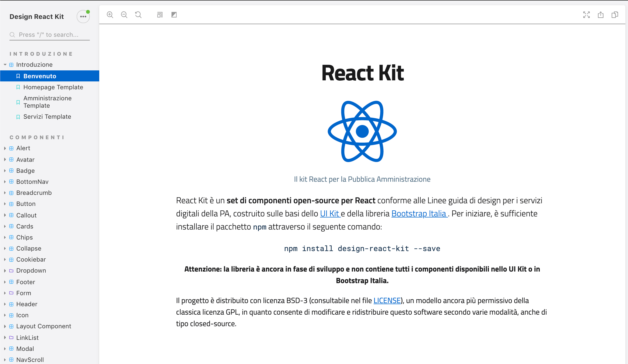
The UI Kit for designers contains sketch files for all the components and themes used within the design system.
UI Kit Docs - Design UI Kit Github
The UI Kit for developers is available as a Bootstrap theme or as Angular components or React components. The React components are also available to browse as live demos with Storybook.
Bootstrap Bootstrap Theme - Github
Angular Documentation - Github
The team working on the Italian Design System really went the extra mile.
6. New Zealand - New Zealand Government Design System
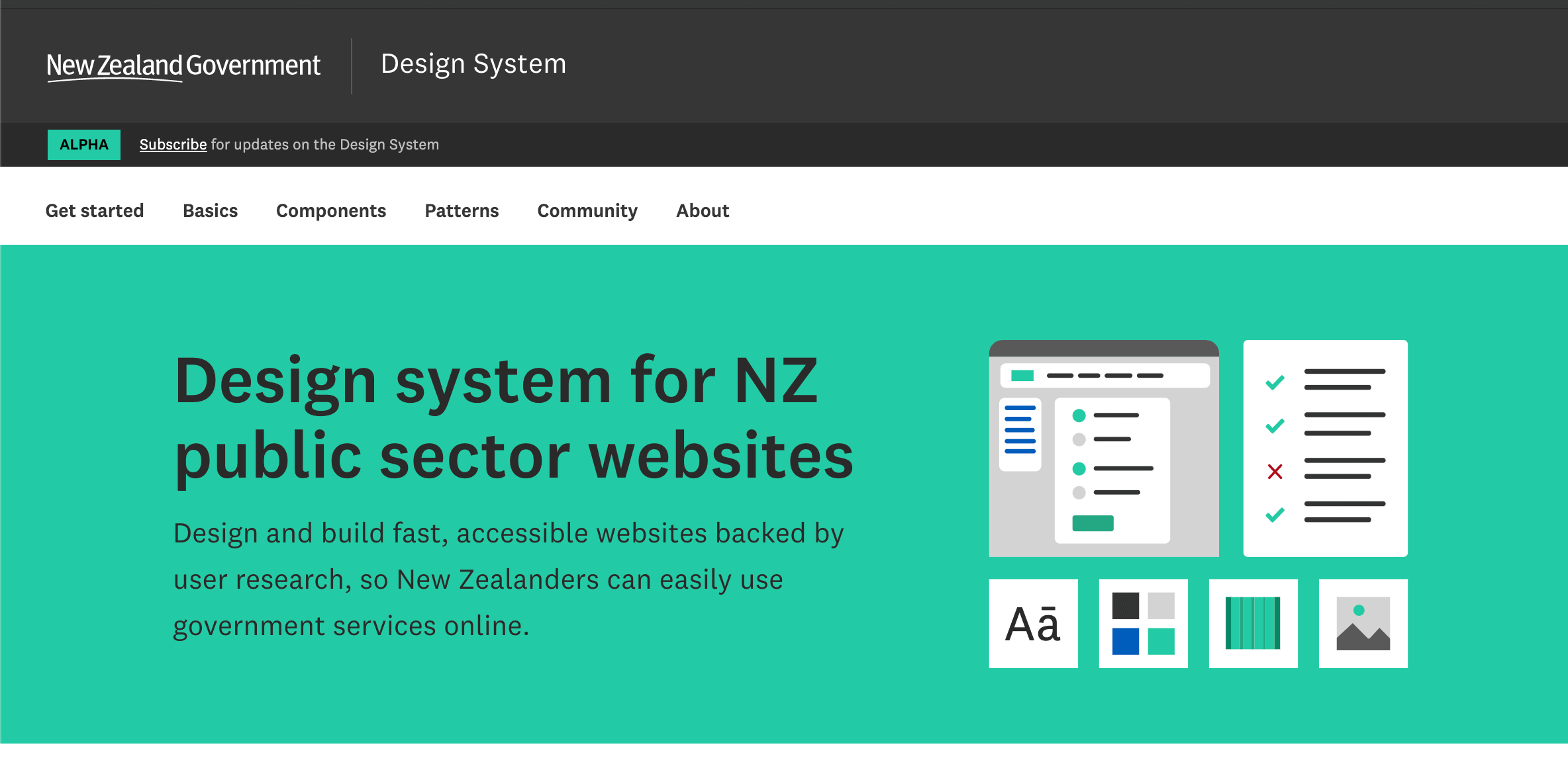
Documentation - Design System Components Github - NPM
The New Zealand Design System is based on the UK Design System and is still in alpha. Currently, the UI kit supports 9 components with two more coming soon. Each component is supports a surprisingly amount of technologies, including CSS, React, Vue, Mustache, TypeScript, and Styled Components.
7. Singapore - SGDS
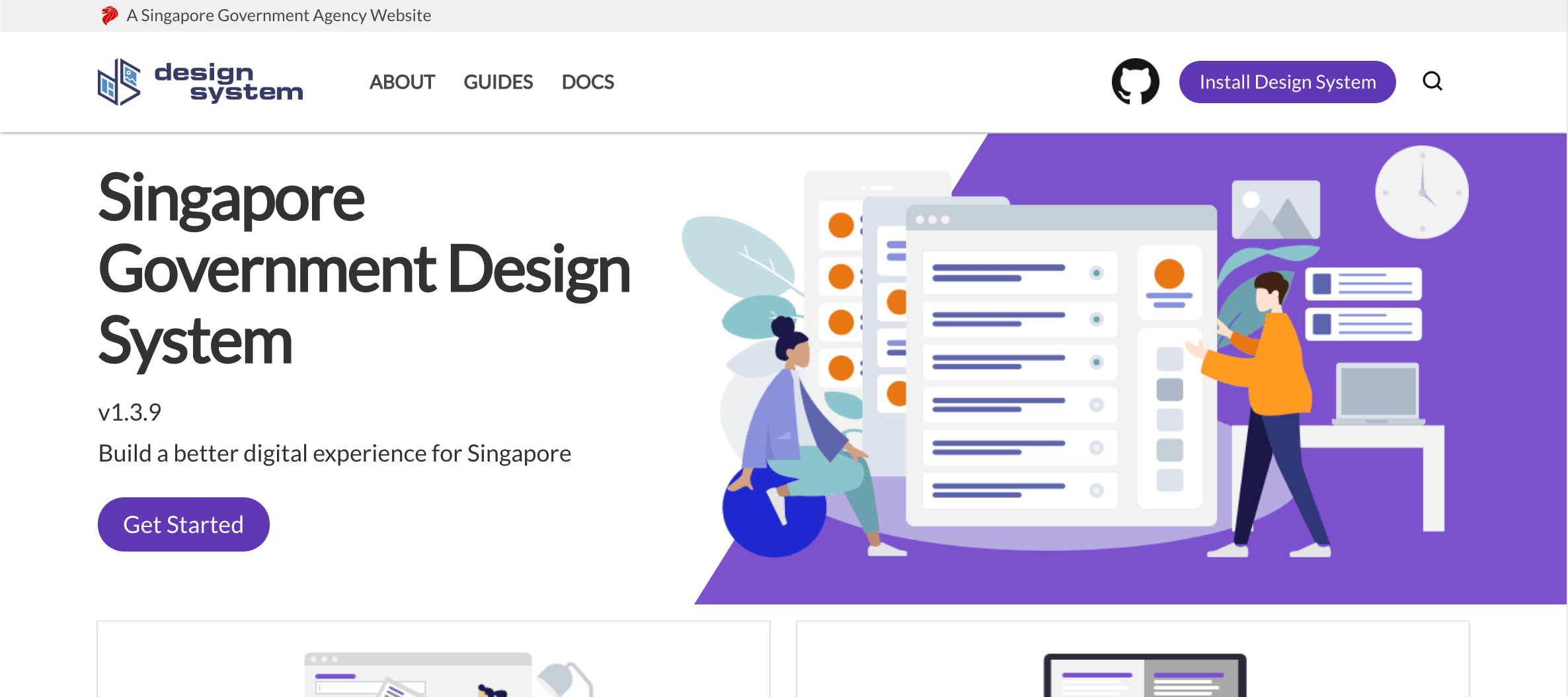
Documentation - Design System Components Github - NPM
The Singapore Design System, or SGDS, provides a set of layout, helper, form, and general components for developers. These components are available as highly customizable SASS components, or as React and Vue components. The React components are also available as live demos with Storybook, similar to the Italian Design System.
SASS Docs
SGDS also provides a Sketch Kit for designers.8. Switzerland - Swiss Style Guide
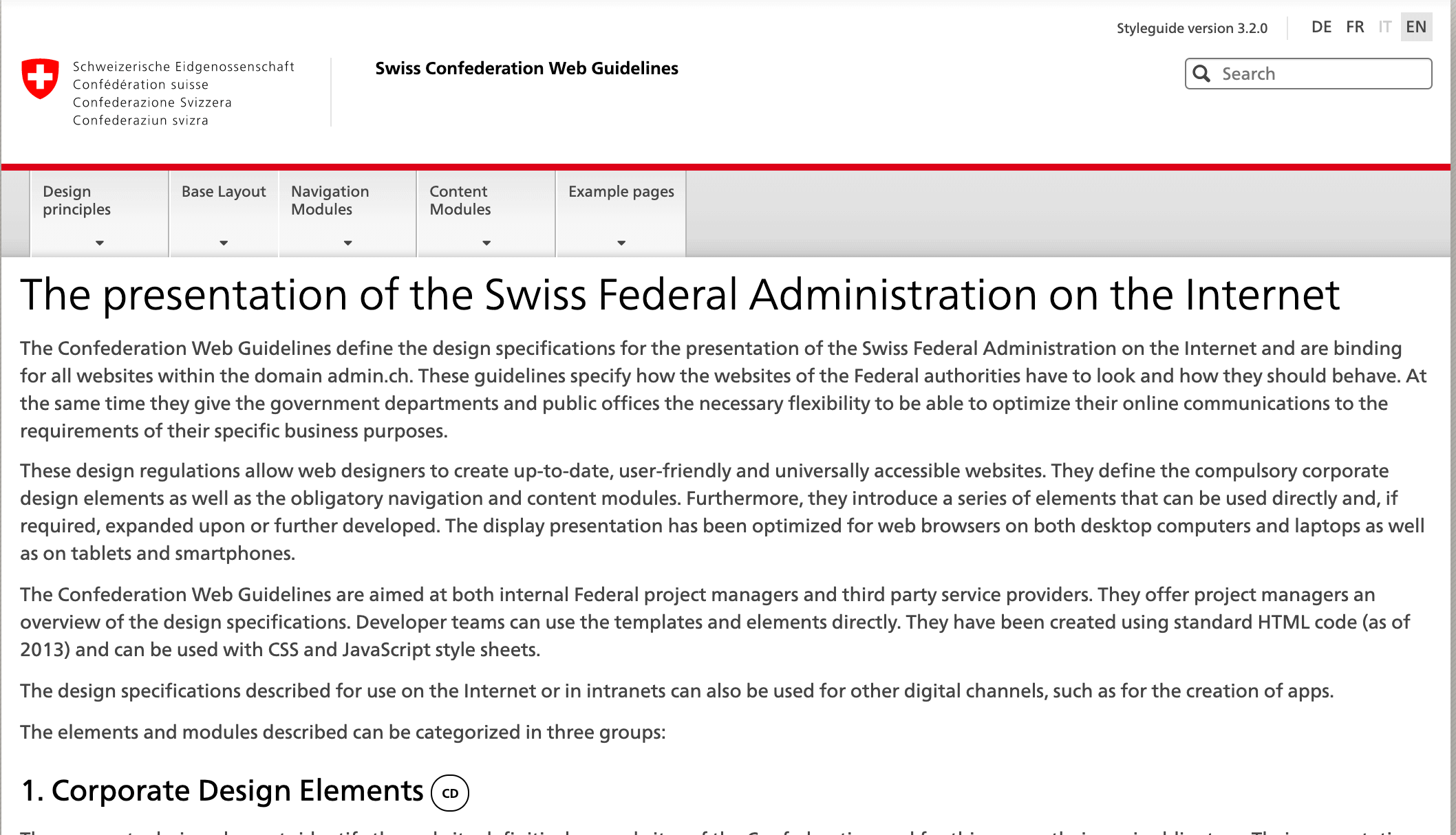
Documentation - Github - NPM
The Swiss Style Guide contains a very large set of components built on CSS and Javascript. The documentation is quite extensive, the Table component for example, has 16 different demos and variations. Additionally, each example has HTML, CSS, or Javascript snippets that can be easily copied.
9. United Kingdom - GOV.UK Design System
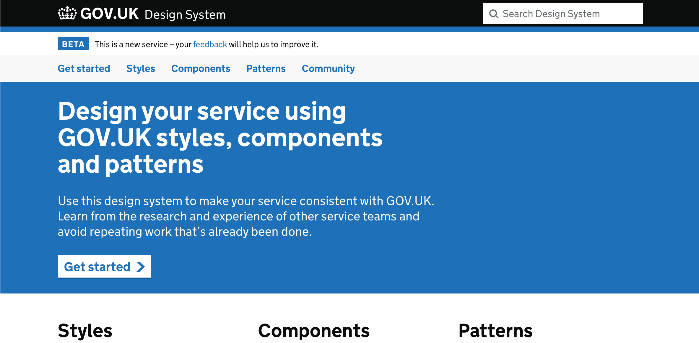
Documentation - Github - NPM
The GOV.UK Design System provides a system of styles, components, and patterns built with SASS and Javascript. Each component page contains not only demos and code snippets, but instructions on how to use the component, when to use the component, and how the component works. Some of the patterns even come with videos to illustrate further. The components are also available in React.
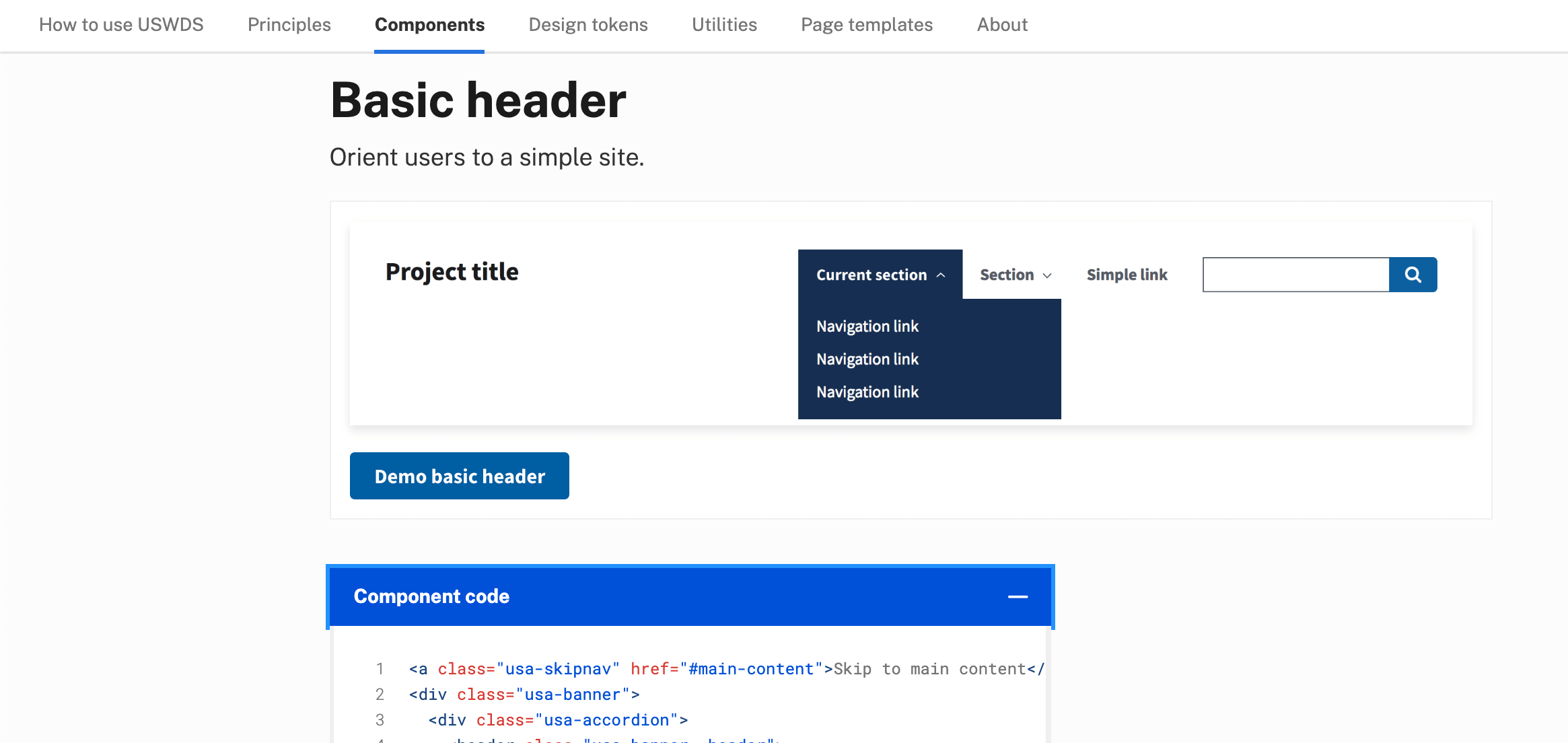
Govuk React10. United States - United States Web Design System
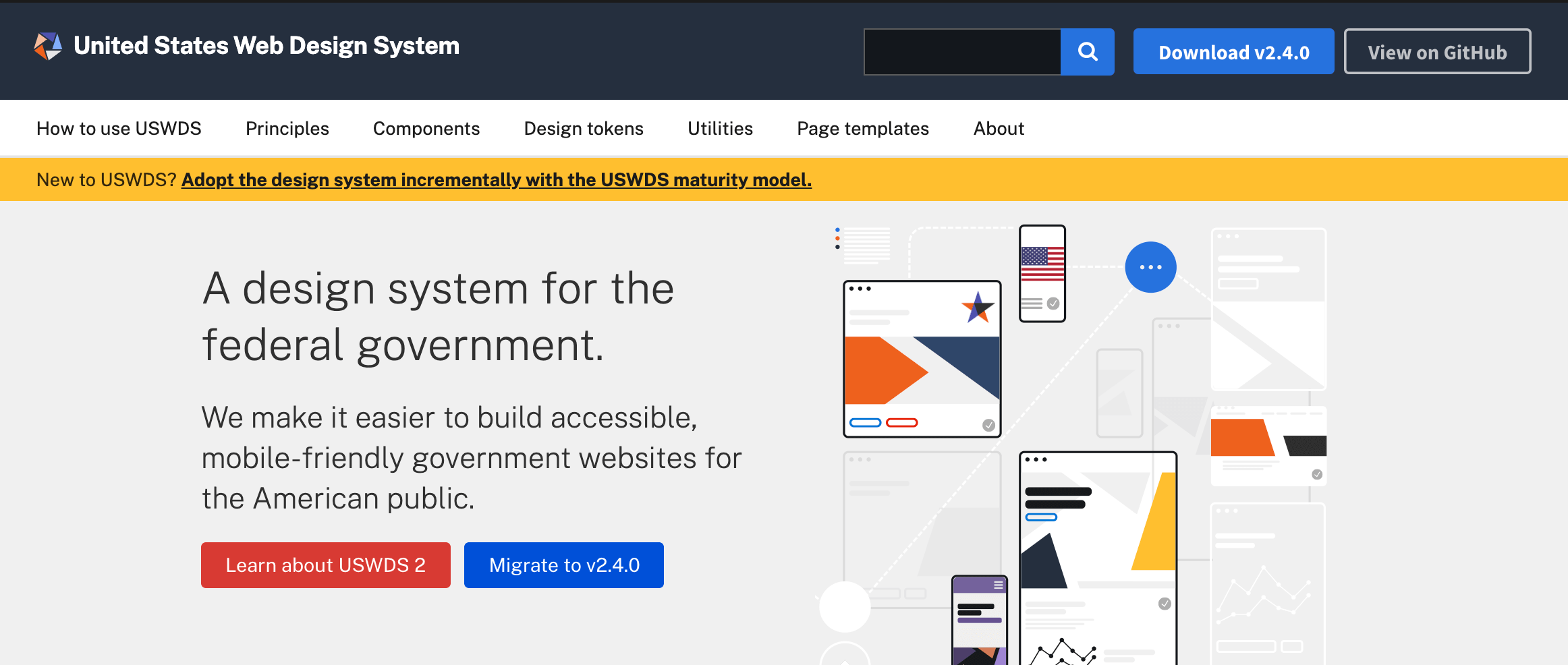
Documentation - Github - NPM - Design Assets
The United States Web Design System (USWDS) provides components, utilities, design tokens, and templates for developers and design assets in Sketch and Adobe XD for designers. Many government agencies use the USWDS for their websites from NASA to White House to U.S Department of Agriculture, check out their showcase to see the full list. Additionally, the USWDS Github Repo is quite active, with 7,812 commits.
The UI kit uses, as with most of the systems in this list, SASS, Javascript. The whole system is quite extensive, luckily their Github Repo gives some guidelines on installing and setting up all the SASS and Javascript files.
Conclusion
From the large tech companies to whole countries, design systems are taking over the world because of their ability to unify a brand across many services, applications, and products.
You Might Also Like
Creating a Material Dev.to Client on Six Platforms with 100% Code Sharing
Learn how to build a Dev.to Client that shares 100% code between six platforms with React Native and Material Bread
Build and Deploy a React Native Web App on Netlify from Scratch
Learn how to build www.howtoexitvim.org with React Native Web and deploy on Netlify from scratch
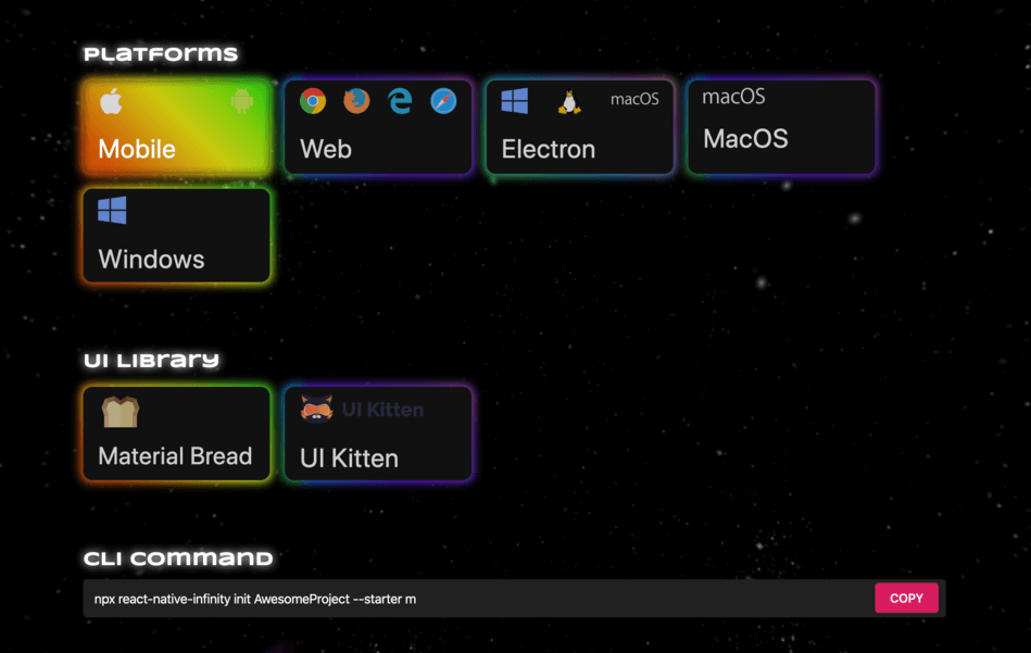
Creating a Dynamic Starter Kit for React Native - React Native Infinity
React Native Infinity CLI generates React Native projects that target any combination of platforms (Web, Electron, Windows, MacOS)