Visualizing the 71 Times Apple Has Been Declared Dead with React and Nivo
March 13, 2020
Doomsayers have been declaring the death of Apple for decades. Apple is not unique in this regard, of course. Every company has had its share of dedicated detractors announcing their demise. Blockbuster's end was predicated for years before it formally announced bankruptcy, while Bitcoin has been declared dead over 380 times since 2010. Some harbingers were right, some were wrong. This article is not here to pass judgment on those predictions or prophesize the future of Apple but simply to visualize some fun data points using Javascript, React, and Nivo Charts.
If you're only interested in the charts themselves and not how they were made then checkout the Apple Doomsayers Demo Page.
Apple Death Knell Data
The data is sourced from The Mac Observer's excellent Apple Death Knell Counter, which is a collection of predictions from public figures, mostly journalists, about the end of Apple. The Mac Observer staff curates the list to include only instances where the speaker is specifically stating the demise and doom of Apple and not include a simply negative sentiment.
Articles where Apple is referred to as "beleaguered" are not necessarily eligible, and in fact, the vast majority of such references are simply colorfully negative descriptions that do not qualify as an Apple Death Knell. - The Mac Observer
Unfortunately, some of the earliest death knells no longer link to live web pages. A few of these can be found on the Wayback Machine, but others cannot. For visualization purposes, we're just going to trust that all accounts are accurate.
I scraped the data from MacObserver using Beautiful Soup to scrape the Title, Author, Date, Source, and Publisher for each entry.

This gives us an array of 71 objects where each object represents one predication. From this data alone we can create our first graph. Rather than build these charts from scratch, we're going to use Nivo, which provides a set of highly customizable React components built on D3 for visualizing data. We're also going to use Day.js for dealing with dates and times.
Deaths Per Year - Data Transform
What we want to display is the number of deaths per year, which means we need to transform our array of deaths into an array of objects with two keys, one for the year of deaths and one for the number of deaths. Since Nivo requires data along the x-axis to be named x and data along the y-axis to be named y, we'll add the year to x and number of deaths to y.
1.function calculateYearsBetween(startYear) {2. let currentYear = new Date().getFullYear();3. let years = [];4. startYear = startYear;5. while (startYear <= currentYear) {6. years.push({ x: startYear, y: 0 });7. startYear++;8. }9. return years;10.}
Next, create a function that loops through the death array and increments the correct year in the yearArray. Nivo again requires a special object format that includes a unique id to name the chart and data property to contain the actual data we want to visualize, which is the yearArray.
1.function deathsPerYear() {2. const yearArray = calculateYearsBetween(1994);3.4. appleDeaths.forEach((death, index) => {5. const dayjsDate = dayjs(death.Date);6. const yearOfDeath = dayjsDate.get("year");7. const inYearArray = yearArray.findIndex(year => {8. return year.year == yearOfDeath;9. });10. yearArray[inYearArray].y++;11. });12.13. const formattedData = [{ id: "deaths", data: yearArray }];14. return formattedData;15.}
The result of the two functions above is an array that looks like this:
1.[2. id: 'deaths',3. data: [4. {x: 1994: y: 0},5. {x: 1995: y: 1},6. {x: 1996: y: 2},7. {x: 1997: y: 7},8. ...9. ]10.]
Deaths Per Year - Charts with Nivo
Using Nivo's Line chart we can graph the above data for each year. Although Nivo charts have props for practically every part of the graph, all we need to get started is a defined height and width. We'll also define a container with overflow: auto so we can see the full chart on mobile by scrolling.
1.import { Line } from "@nivo/line";2.import React from "react";3.import { deathsPerYear } from "./data";4.5.const DeathsPerYearGraph = () => {6. const newData = deathsPerYear();7.8. return (9. <div style={styles.container}>10. <Line data={newData} margin width={780} height={500} />11. </div>12. );13.};14.15.const styles = {16. container: {17. height: 500,18. maxWidth: 780,19. overflow: "auto",20. },21.};22.23.export { DeathsPerYearGraph };
Nivo Chart Margins
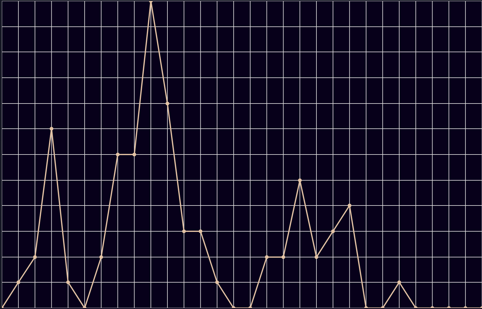
The first problem is that there is no margin between the graph itself and the edge of the container, which means the row and column labels are hidden. The margin prop allows us to define this margin and reveal the labels.
1....2.<Line data={newData} width={780} height={500} margin={styles.chartMargin} />3....4.chartMargin: {5. top: 50,6. right: 50,7. bottom: 50,8. left: 60,9.},10....
Nivo Axis Legends and Grid Lines
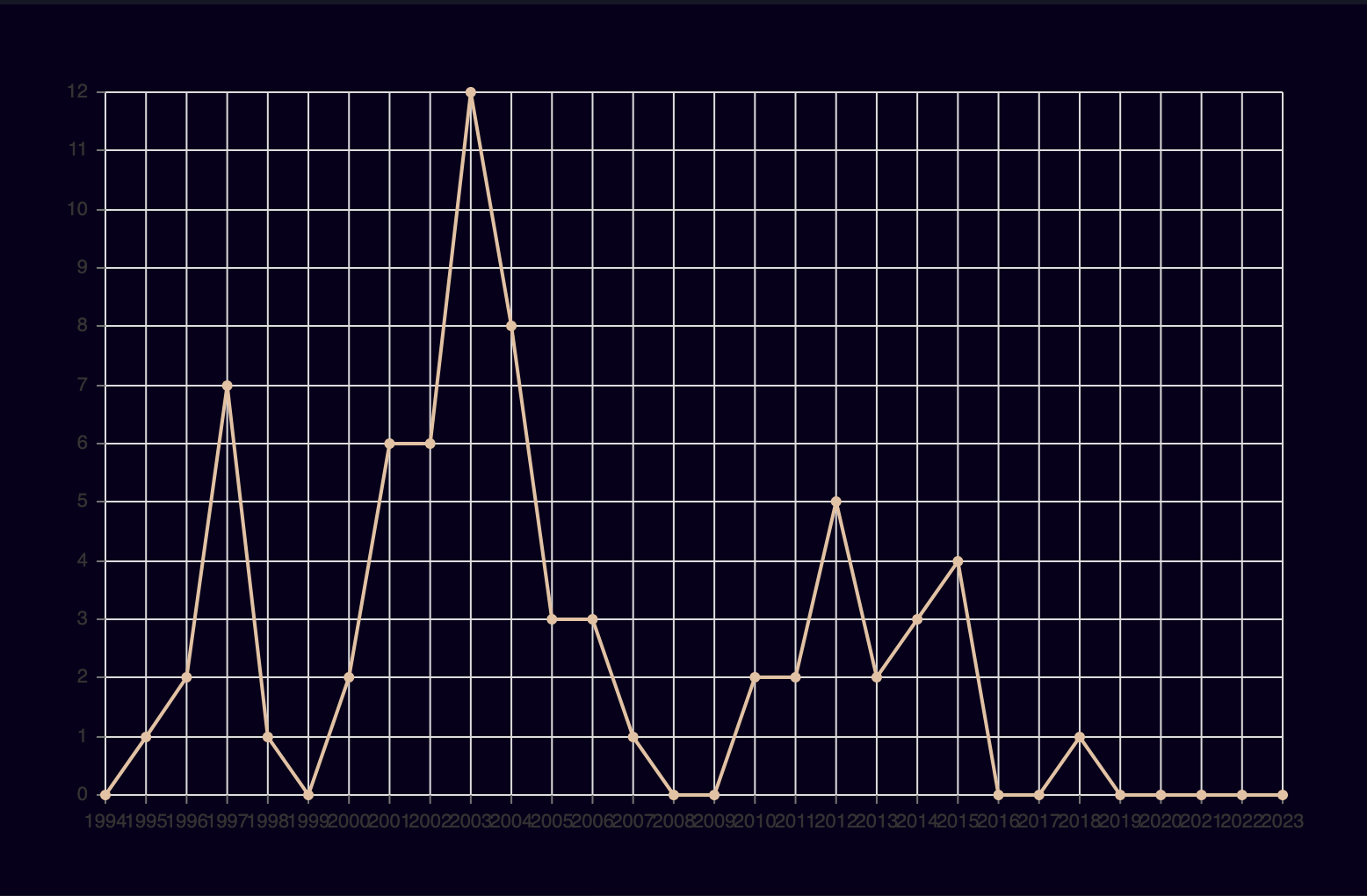
By default, Nivo charts do not have axis legends, but we can add a legend to any side of the chart using axisBottom, axisLeft, axisRight, and axisTop props. These props take in an object with various properties that allow us to, among other things, add legends, position legends, define axis tick size, padding, and rotation.
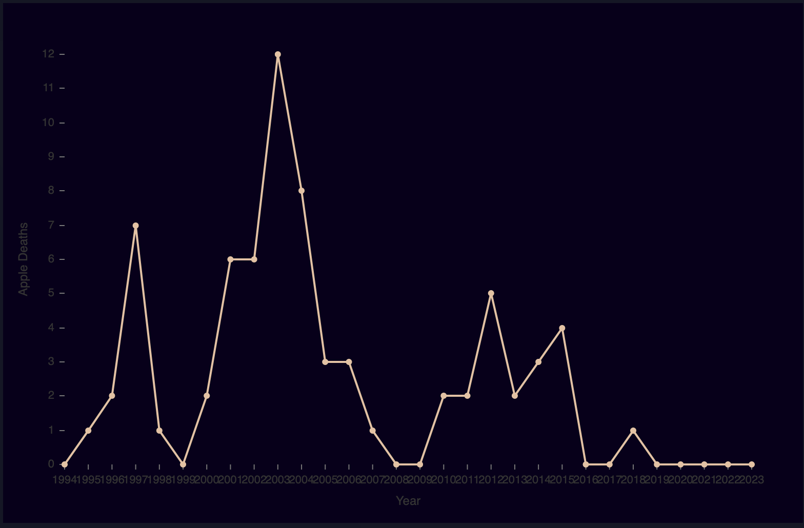
We can also remove the grid lines, which I think are distracting, by passing false to both the enableGridX and enableGridY prop.
1....2.<Line3. data={newData}4. width={780}5. height={500}6. margin={styles.chartMargin}7. enableGridX={false}8. enableGridY={false}9. axisBottom={styles.axisBottom}10. axisLeft={styles.axisLeft}11./>12....13.axisLeft: {14. orient: "left",15. tickSize: 5,16. tickPadding: 5,17. tickRotation: 0,18. legend: "Apple Deaths",19. legendOffset: -40,20. legendPosition: "middle",21.},22.axisBottom: {23. orient: "bottom",24. tickSize: 5,25. tickPadding: 5,26. tickRotation: 0,27. legend: "Year",28. legendOffset: 36,29. legendPosition: "middle",30.},31....
Nivo Theme and Points
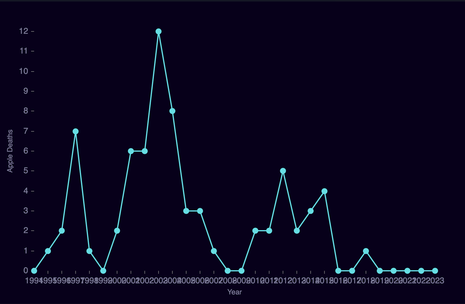
Out-of-the-box Nivo charts can utilize color schemes from the d3-scale-chromotic module, but we can define a completely custom theme by passing in an array of colors to the colors prop. Passing in one color will define the color for the line, however, it will not define the color of the actual data points, that is, the circles on the line. To change the point size and color we can use the aptly named, pointSize and pointColor props.
Nivo charts also accept a theme prop that will allow us to style the text color and text size to make it readable on dark backgrounds.
1....2.<Line3. data={newData}4. width={780}5. height={500}6. margin={styles.chartMargin}7. enableGridX={false}8. enableGridY={false}9. axisBottom={styles.axisBottom}10. axisLeft={styles.axisLeft}11. colors={["#03e1e5"]}12. theme={styles.theme}13. pointSize={10}14. pointColor={"#03e1e5"}15./>16....17.theme: {18. fontSize: "14px",19. textColor: "#7b7b99",20.},21....
Nivo X-Axis Scale
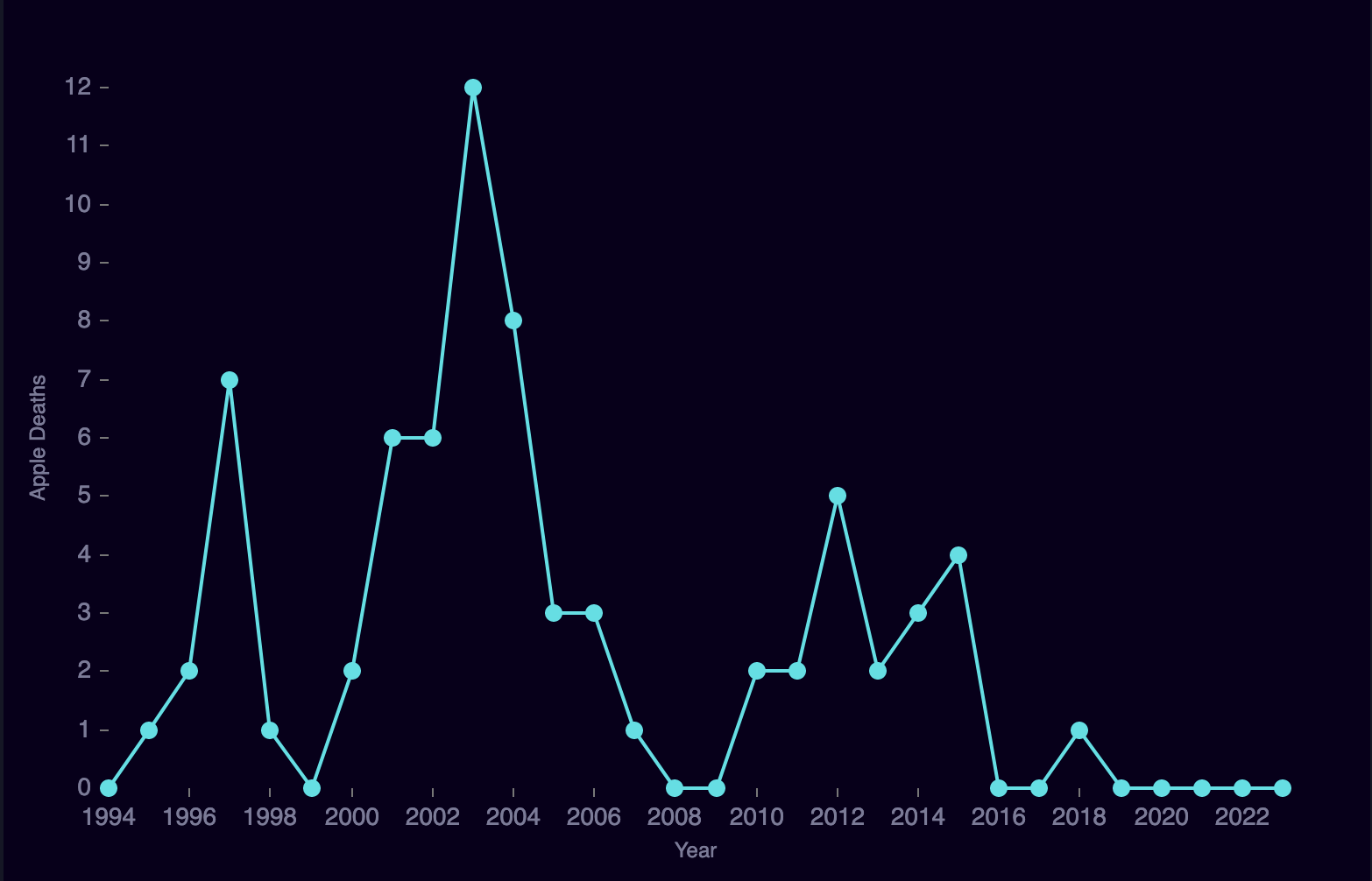
Now that the labels are much easier to read, you'll notice that the x-axis column names are overlapping. The chart is trying to show a label for every single data point along the x-axis, which is the default behavior for scale type point. We can change the x-axis scale type with the property xScale. In this case, we want to change the scale type to linear, which will display labels evenly across a specific range. If do not provide that range, then the chart will start from 0 and show equal increments to our end date 2020. But we don't care about dates before 1994 (where our data starts), so we need to set a minimum date for the x-axis to start at, which we can do using the min property.
1.<Line2. data={newData}3. width={780}4. height={500}5. margin={styles.chartMargin}6. enableGridX={false}7. enableGridY={false}8. axisBottom={styles.axisBottom}9. axisLeft={styles.axisLeft}10. colors={["#03e1e5"]}11. theme={styles.theme}12. pointSize={10}13. pointColor={"#03e1e5"}14. xScale={{ type: "linear", min: "1994" }}15./>
Nivo Hover Labels
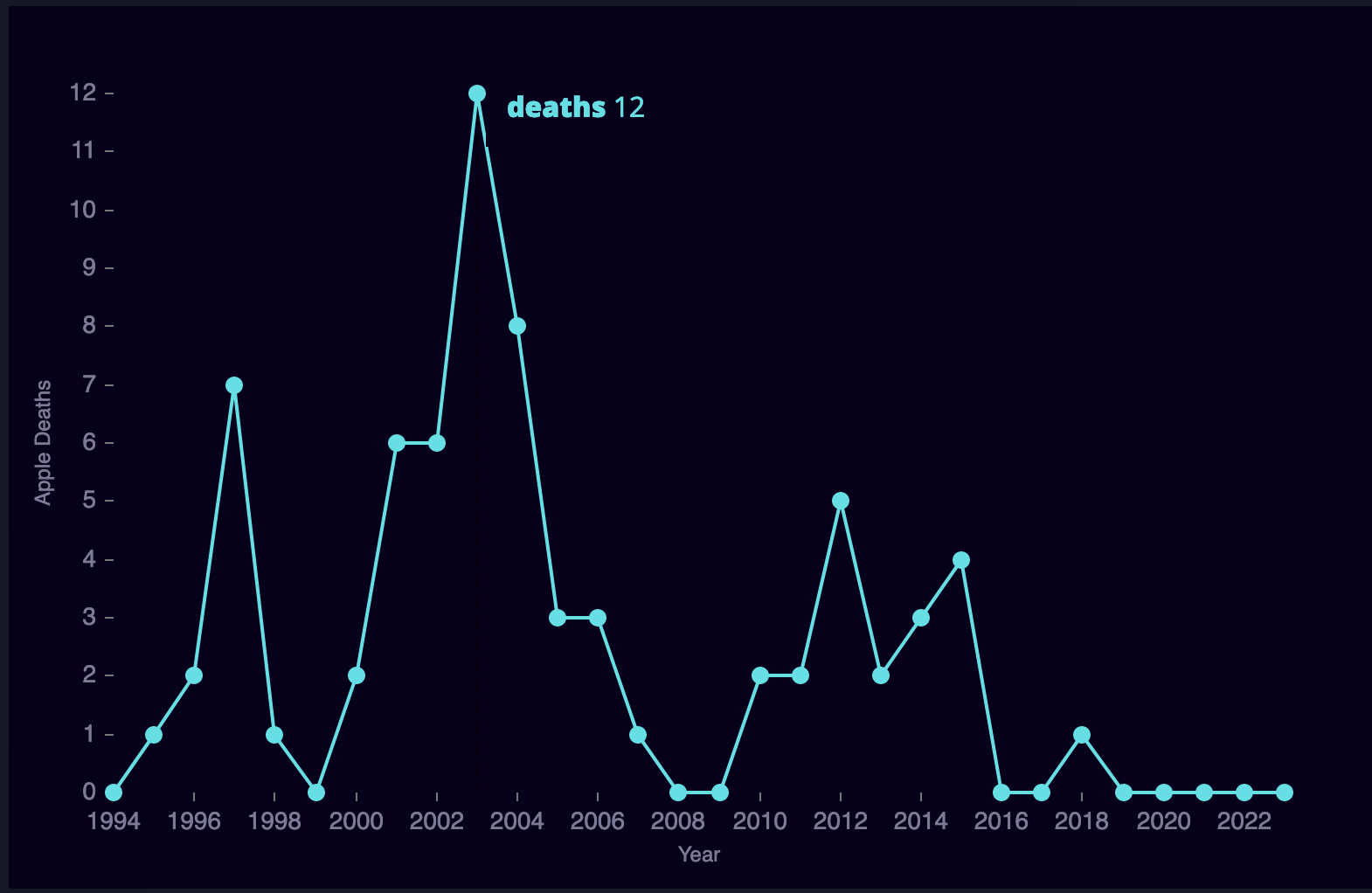
Adding the useMesh prop will display a label next to each data point when you hover over it with the values for that data pont. To customize this hover label, however, we need to provide our own label component. First, create a custom label component, Tooltip, which takes slice as a prop. Nivo will pass each data point (slice) to this component with other useful information about the chart to create a custom label.
1.const Tooltip = function({ slice }) {2. return (3. <div4. style={{5. background: "#09001b",6. padding: "9px 12px",7. }}8. >9. {slice.points.map(point => (10. <div11. key={point.id}12. style={{13. color: point.serieColor,14. padding: "3px 0",15. }}16. >17. <strong>{point.serieId}</strong> {point.data.yFormatted}18. </div>19. ))}20. </div>21. );22.};
Now we can pass this custom Tooltip into the sliceTooltip prop with the slice prop. Also, enable custom tooltips (hover labels) by providing the enableSlices prop with the string, 'x'
1.<Line2. data={newData}3. width={780}4. height={500}5. margin={styles.chartMargin}6. enableGridX={false}7. enableGridY={false}8. axisBottom={styles.axisBottom}9. axisLeft={styles.axisLeft}10. colors={["#03e1e5"]}11. theme={styles.theme}12. pointSize={10}13. pointColor={"#03e1e5"}14. xScale={{ type: "linear", min: "1994" }}15. enableSlices="x"16. sliceTooltip={({ slice }) => {17. return <Tooltip slice={slice} />;18. }}19./>
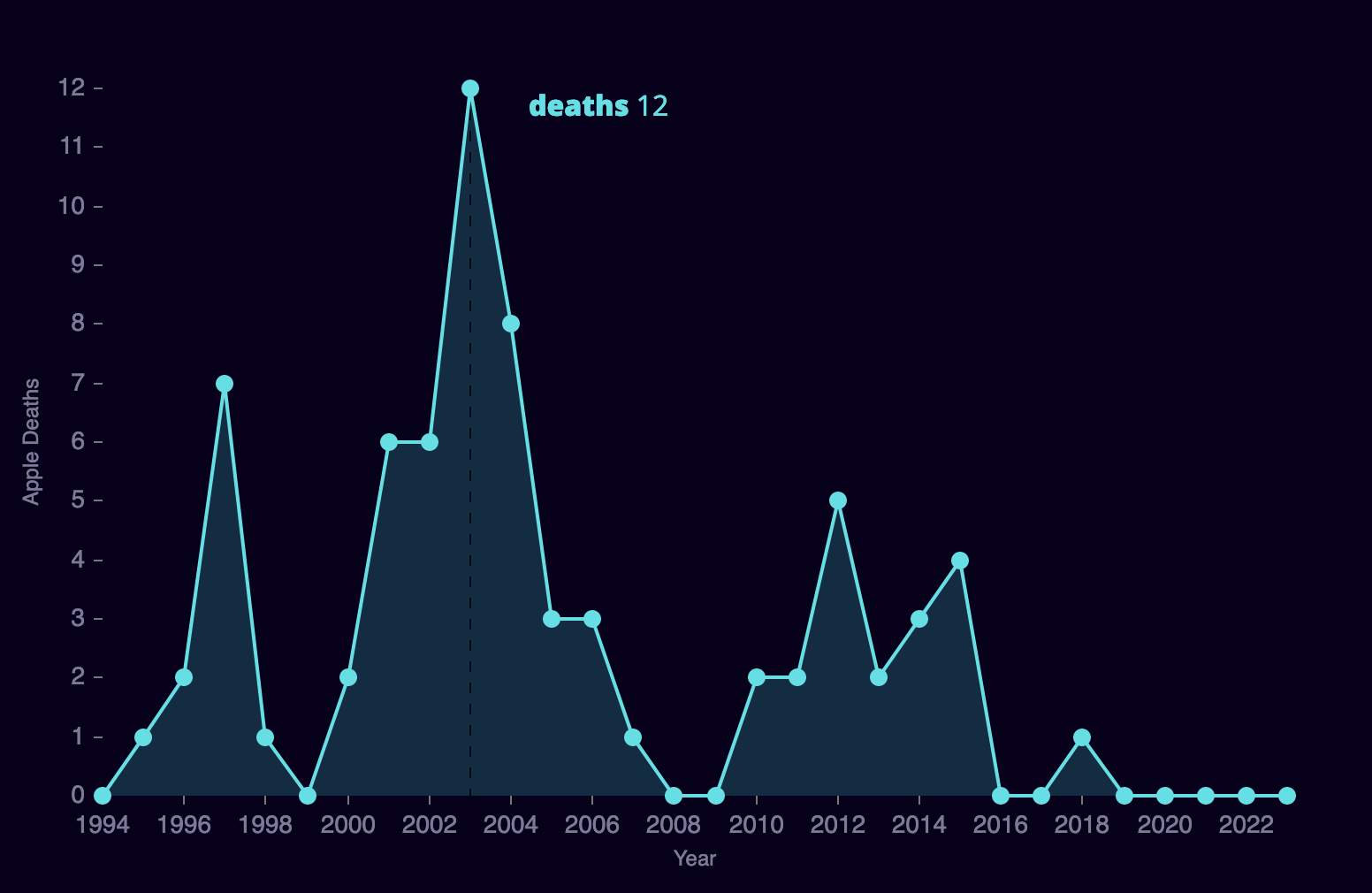
Now when you hover over the chart, a tooltip will display the number of deaths.
Nivo Area Chart
We can easily convert this line chart into an Area chart by adding the enableArea prop.
1.<Line2. data={newData}3. width={780}4. height={500}5. margin={styles.chartMargin}6. xScale={{ type: "linear", min: "1994" }}7. enableGridX={false}8. enableGridY={false}9. axisBottom={styles.axisBottom}10. axisLeft={styles.axisLeft}11. colors={["#03e1e5"]}12. pointSize={10}13. pointColor={"#03e1e5"}14. theme={styles.theme}15. enableSlices="x"16. sliceTooltip={({ slice }) => {17. return <Tooltip slice={slice} />;18. }}19. enableArea={true}20./>
Nivo Highlight Markers
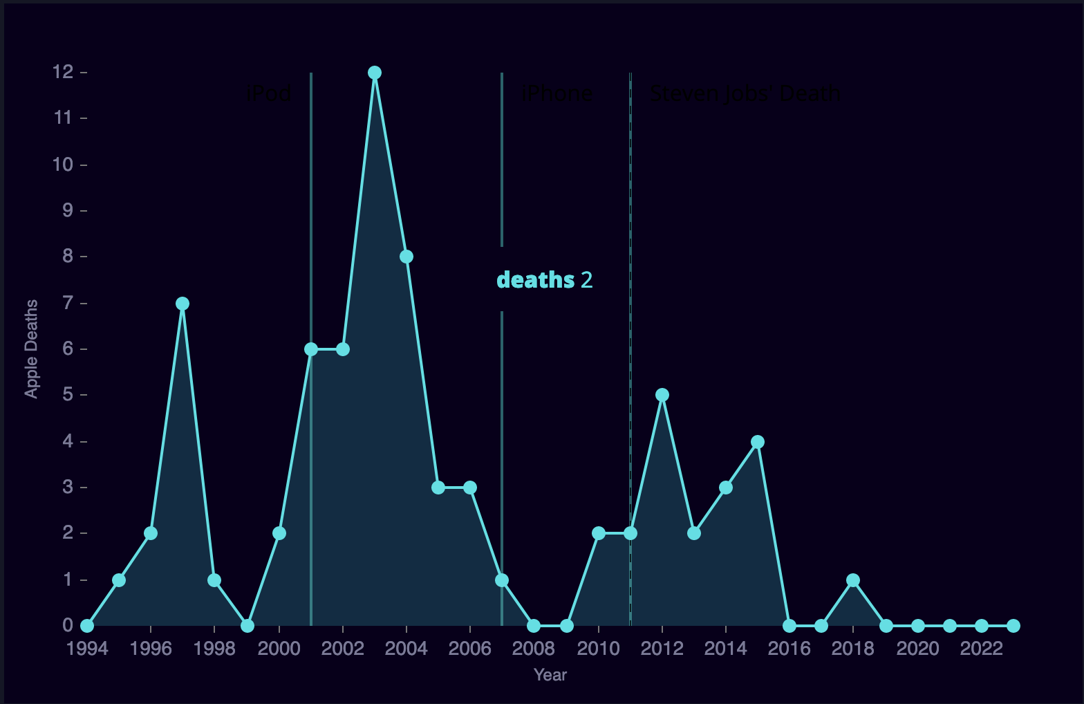
The last things we're going to add to this line chart are markers to highlight specific events in Apple's history on the chart to give more context. Nivo allows us to create vertical or horizontal lines with labels at any point on the chart by passing an array of objects to the markers prop. Each object in that array is a separate marker with properties that define which axis it should display along, the point or value to display, the style of the marker, and the text, if any, to show. Let's create three markers, one for the introduction of the iPod, the introduction of the iPhone, and Steven Job's death.
1.const contextLines = [2.{3. axis: "x",4. value: 2011,5. lineStyle: { stroke: "#09646b", strokeWidth: 2 },6. legend: "Steven Jobs' Death",7. textStyle: {8. fill: "7b7b99",9. },10.},11.{12. axis: "x",13. value: 2007,14. lineStyle: { stroke: "#09646b", strokeWidth: 2 },15. legend: "iPhone",16. textStyle: {17. fill: "7b7b99",18. },19.},20.{21. axis: "x",22. value: 2001,23. lineStyle: { stroke: "#09646b", strokeWidth: 2 },24. legend: "iPod",25. textStyle: {26. fill: "7b7b99",27. },28. orient: "bottom",29. legendPosition: "top-left",30.},31.];
1.<Line2. data={newData}3. width={780}4. height={500}5. margin={styles.chartMargin}6. xScale={{ type: "linear", min: "1994" }}7. enableGridX={false}8. enableGridY={false}9. axisBottom={styles.axisBottom}10. axisLeft={styles.axisLeft}11. colors={["#03e1e5"]}12. pointSize={10}13. pointColor={"#03e1e5"}14. theme={styles.theme}15. enableSlices="x"16. sliceTooltip={({ slice }) => {17. return <Tooltip slice={slice} />;18. }}19. enableArea={true}20. markers={contextLines}21./>
Deaths Per Author - Data Transform
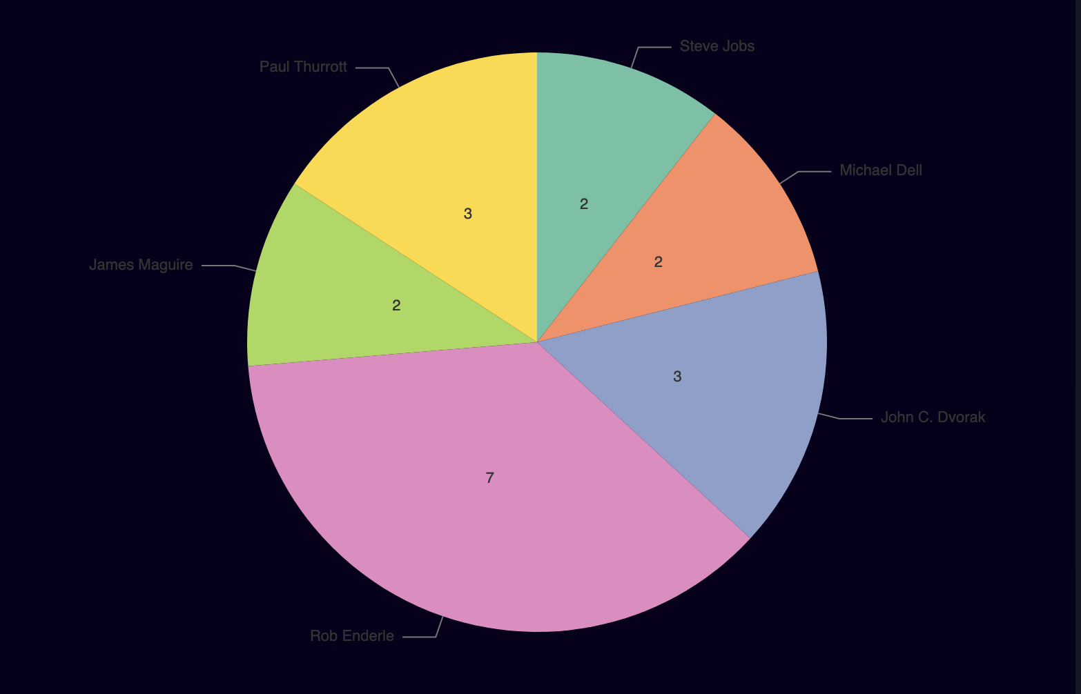
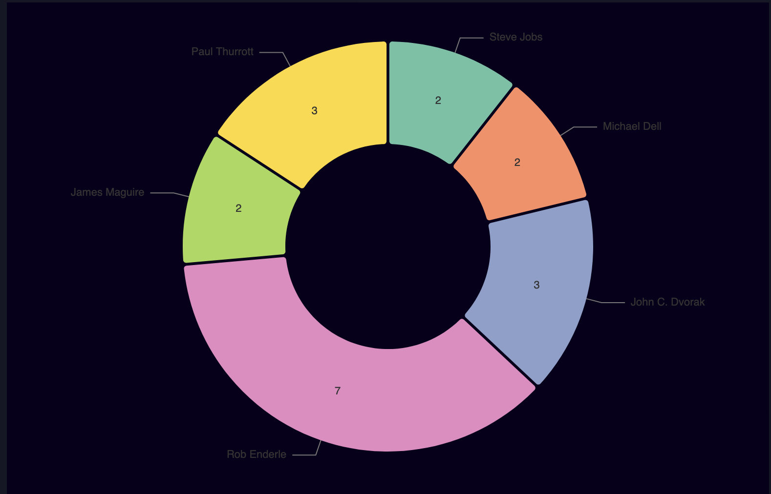
The next chart will be a pie graph displaying the number of death predictions per author. First, similarly to the deaths per year data, we need to transform the death array into an array that shows deaths per author. The Nivo pie chart expects the data to be an array of objects with each object containing an id and value. Creating this array will reveal that the vast majority of predictions were made by different people. To avoid graphing 50+ data points with only 1 value, we will filter the results for authors that have more than one prediction on our list using the filter method. Finally, we only want named authors so we will also filter out all "Unknown" authors.
1.export function deathsPerAuthor() {2. const perAuthorArray = [];3.4. appleDeaths.forEach((death, index) => {5. if (index == 0) {6. perAuthorArray.push({ id: death.Author, value: 1 });7. }8. const inPerAuthorArray = perAuthorArray.findIndex(author => {9. return author.id == death.Author;10. });11. if (inPerAuthorArray > -1) {12. perAuthorArray[inPerAuthorArray].value++;13. } else {14. perAuthorArray.push({ id: death.Author, value: 1 });15. }16. });17. const filtered = perAuthorArray.filter(author => author.value > 1);18. return filtered;19.}
The data will end up looking like this:
1.[2. {3. id: "Michael Dell",4. value: 2,5. },6. ...7.];
Deaths Per Author - Nivo Pie Chart
We can create a simple Pie chart using the data above in a similar way to the line chart above. Remember, we need to set margins within the chart so nothing will get cut off. Let's also set the scheme to set2.
1.import { Pie } from "@nivo/pie";2.import React from "react";3.import { deathsPerAuthor } from "./data";4.5.const DeathsPerAuthor = ({ version }) => {6. const newData = deathsPerAuthor();7.8. return (9. <div style={styles.container}>10. <Pie11. data={newData}12. width={780}13. height={500}14. margin={styles.chartMargin}15. colors={{ scheme: "set2" }}16. />17. </div>18. );19.};20.21.const styles = {22. container: {23. height: 500,24. maxWidth: 780,25. background: "#09001b",26. overflow: "auto",27. },28. chartMargin: {29. top: 40,30. right: 80,31. bottom: 40,32. left: 80,33. },34.};35.36.export { DeathsPerAuthor };
Nivo Donut Chart and Section Styles
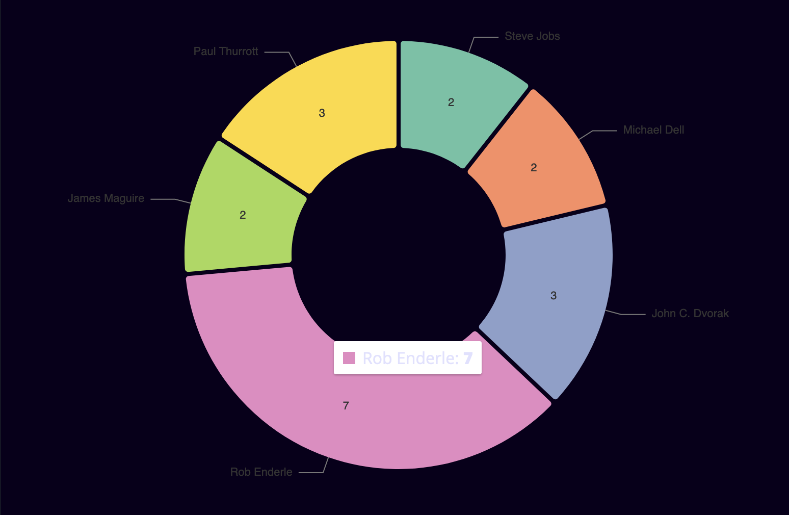
Nivo allows us to create a donut chart by defining the size of the inner radius using the innerRadius prop, try playing around with this prop on Nivo's interactive documentation for pie charts. We can add some padding in between each data section using the padAngle prop, which will make it easier to distinguish each section. The cornerRadius prop defines the radius of each section of the pie.
1.<ResponsivePie2. data={newData}3. width={780}4. height={500}5. margin={styles.chartMargin}6. colors={{ scheme: "set2" }}7. animate={true}8. innerRadius={0.5}9. padAngle={0.7}10. cornerRadius={3}11. borderWidth={1}12. borderColor={{ from: "color", modifiers: [["darker", 0.2]] }}13./>
Nivo Radial Labels
The chart labels are hard to read on dark backgrounds, luckily Nivo gives ample customization of these labels. We can change the label color with the radialLabelsTextColor prop. The radialLabelsLinkDiagonalLength and radialLabelsLinkHorizontalLength props allow us to customize the exact length of each part of the line to the label, while radialLabelsLinkStrokeWidth defines the line's width. The radialLabelsLinkColor defines the color of the line, setting this to from: "color" will make the line match the color of the section it's coming from. Finally, we can also customize the spacing between the line, label, and data section, but I think the defaults are fine here.
1.<ResponsivePie2. data={newData}3. width={780}4. height={500}5. margin={styles.chartMargin}6. colors={{ scheme: "set2" }}7. animate={true}8. innerRadius={0.5}9. padAngle={0.7}10. cornerRadius={3}11. radialLabelsTextColor="#7b7b99"12. radialLabelsLinkDiagonalLength={16}13. radialLabelsLinkHorizontalLength={24}14. radialLabelsLinkStrokeWidth={1.3}15. radialLabelsLinkColor={{ from: "color" }}16./>
Nivo Legends
Nivo legends are available for each chart type and are defined as an array of objects on the legends prop. The legend position, in relation to the chart itself, is defined by the anchor property, for this chart let's define it at the bottom. The direction prop can either be a row or a column. Each legend item can further be customized with the specific props itemWidth, itemWidth, and itemTextColor. The symbol that appears next to the text can either be a circle, triangle, square, or diamond. Finally, we need to change the bottom chart margins to give room for this legend.
1.<ResponsivePie2. data={newData}3. width={780}4. height={500}5. margin={{ top: 40, right: 80, bottom: 80, left: 80 }}6. colors={{ scheme: "set2" }}7. animate={true}8. innerRadius={0.5}9. padAngle={0.7}10. cornerRadius={3}11. radialLabelsTextColor="#7b7b99"12. radialLabelsLinkDiagonalLength={16}13. radialLabelsLinkHorizontalLength={24}14. radialLabelsLinkStrokeWidth={1}15. radialLabelsLinkColor={{ from: "color" }}16. legends={[17. {18. anchor: "bottom",19. direction: "row",20. translateY: 56,21. itemWidth: 120,22. itemHeight: 18,23. itemTextColor: "#999",24. symbolSize: 18,25. symbolShape: "circle",26. },27. ]}28./>
Deaths Per Publication - Data Transform
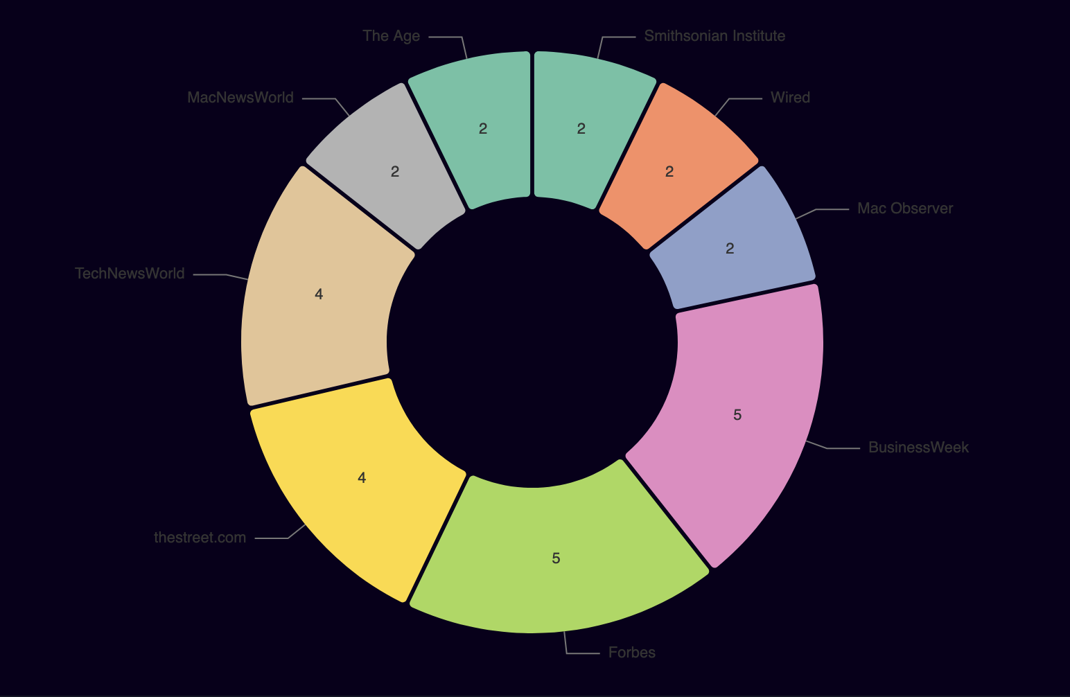
This function is almost identical to the per author function except we're looking for publications that have multiple death knells, instead of authors. We could create a shared function that accepts a property to filter for, but we can just as easily copy and paste for now.
1.export function deathsPerPublication() {2. const perPubArray = [];3. appleDeaths.forEach((death, index) => {4. if (index == 0) {5. perPubArray.push({ id: death.Publisher, value: 1 });6. }7. const inPerAuthorArray = perPubArray.findIndex(author => {8. return author.id == death.Publisher;9. });10. if (inPerAuthorArray > -1) {11. perPubArray[inPerAuthorArray].value++;12. } else {13. perPubArray.push({ id: death.Publisher, value: 1 });14. }15. });16. const filtered = perPubArray.filter(author => {17. const isAboveOne = author.value > 1;18. const isNotUnknown = author.id !== "Unknown";19. return isAboveOne && isNotUnknown;20. });21. return filtered;22.}
The data will end up looking like this:
1.[2. {3. id: "Mac Observer",4. value: 2,5. },6. ...7.];
Deaths Per Publication - Pie Chart
The data here is so similar to the per author data that we're going to resuse the pie chart we created above and simply provide this publication data.
1.import { Pie } from "@nivo/pie";2.import React from "react";3.import { deathsPerPublication } from "./data";4.5.const DeathsPerPublication = ({ version }) => {6. const newData = deathsPerPublication();7.8. let chart = (9. <Pie10. data={newData}11. width={780}12. height={500}13. margin={styles.chartMargin}14. colors={{ scheme: "set2" }}15. animate={true}16. innerRadius={0.5}17. padAngle={0.7}18. cornerRadius={3}19. radialLabelsTextColor="#7b7b99"20. radialLabelsLinkDiagonalLength={16}21. radialLabelsLinkHorizontalLength={24}22. radialLabelsLinkStrokeWidth={1}23. radialLabelsLinkColor={{ from: "color" }}24. />25. );26.27. return <div style={styles.container}>{chart}</div>;28.};29.30.const styles = {31. container: {32. height: 500,33. maxWidth: 780,34. background: "#09001b",35. },36. chartMargin: {37. top: 40,38. right: 80,39. bottom: 40,40. left: 80,41. },42.};43.44.export { DeathsPerPublication };

Word cloud
For fun, I generated a word cloud using wordclouds.com with all the relevant death knell quotes.

Conclusion
Nivo charts contain a lot of functionality out-of-the-box while allowing developers to customize almost all aspects of a chart. However, there are numerous other charting libraries for React and Javascript, check out How to Build a Bitcoin DCA Chart with React and Recharts to see how Recharts differs from Nivo.
