A Simple Ice Cream Cone With CSS
March 17, 2020
Ice Cream CSS
The ice cream part is composed of two shapes, a big circle and a wide oval. The oval overlaps the the bottom of the main ice cream circle to give the illusion that it's spilling over the cone.
1.<div class="icecream"></div>
1..icecream {2. background-color: #7ac5be;3. width: 100px;4. height: 100px;5. border-radius: 100%;6. position: relative;7.}8.9..icecream::after {10. content: "";11. position: absolute;12. bottom: 10px;13. left: 0px;14. height: 30px;15. background: #7ac5be;16. width: 100px;17. border-radius: 100%;18. z-index: 2;19.}
Cone CSS
A 2d ice cream cone is really just an isosceles triangle. We can create a triangle in CSS by removing the height and width and creating thick borders on the left, right, and top.
1.<div class="cone"></div>
1..cone {2. margin-top: -20px;3. height: 0px;4. width: 0px;5. border-right: 45px solid transparent;6. border-left: 45px solid transparent;7. border-top: 140px solid tan;8. z-index: 1;9.}
More CSS Snippets
Popular Articles
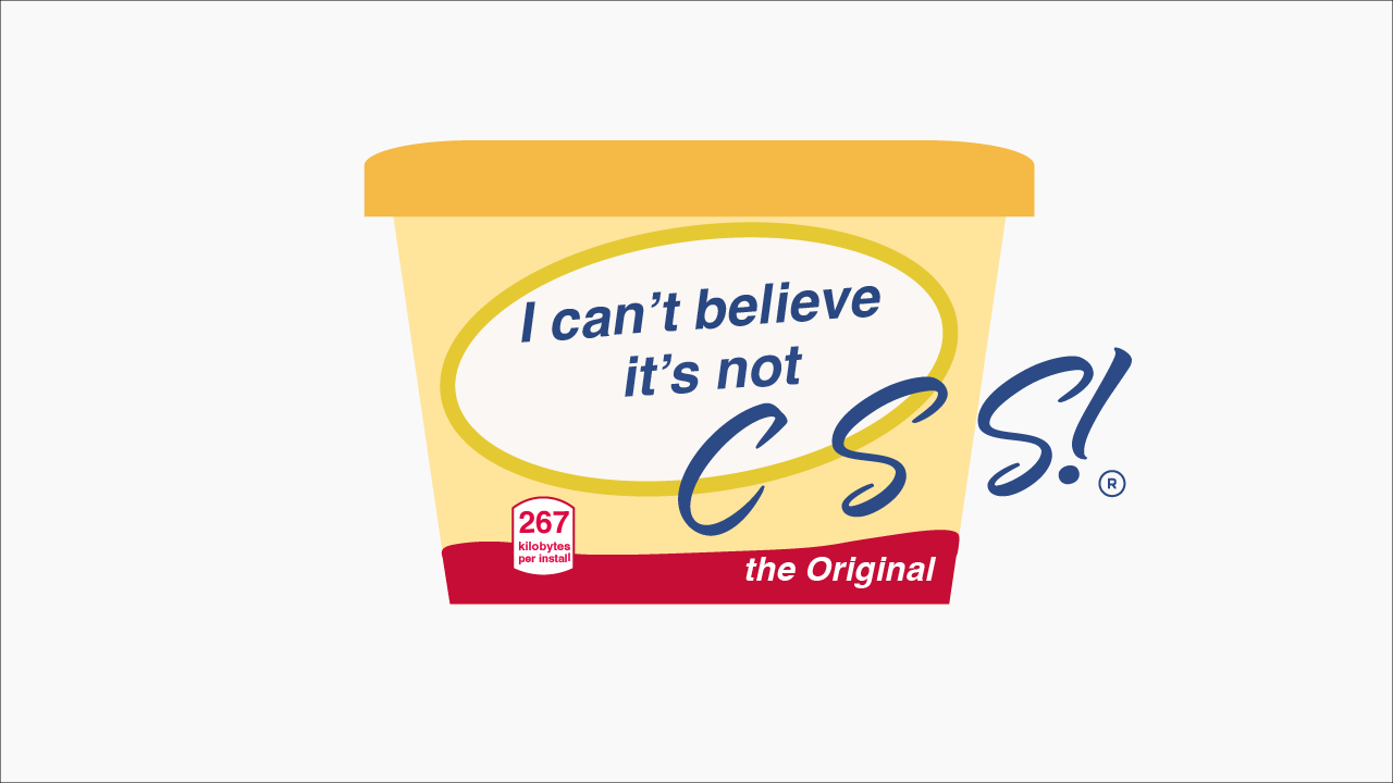
I Can't Believe It's Not CSS: Styling Websites with SQL
Style websites using SQL instead of CSS. Database migrations for your styles. Because CSS is the wrong kind of declarative.
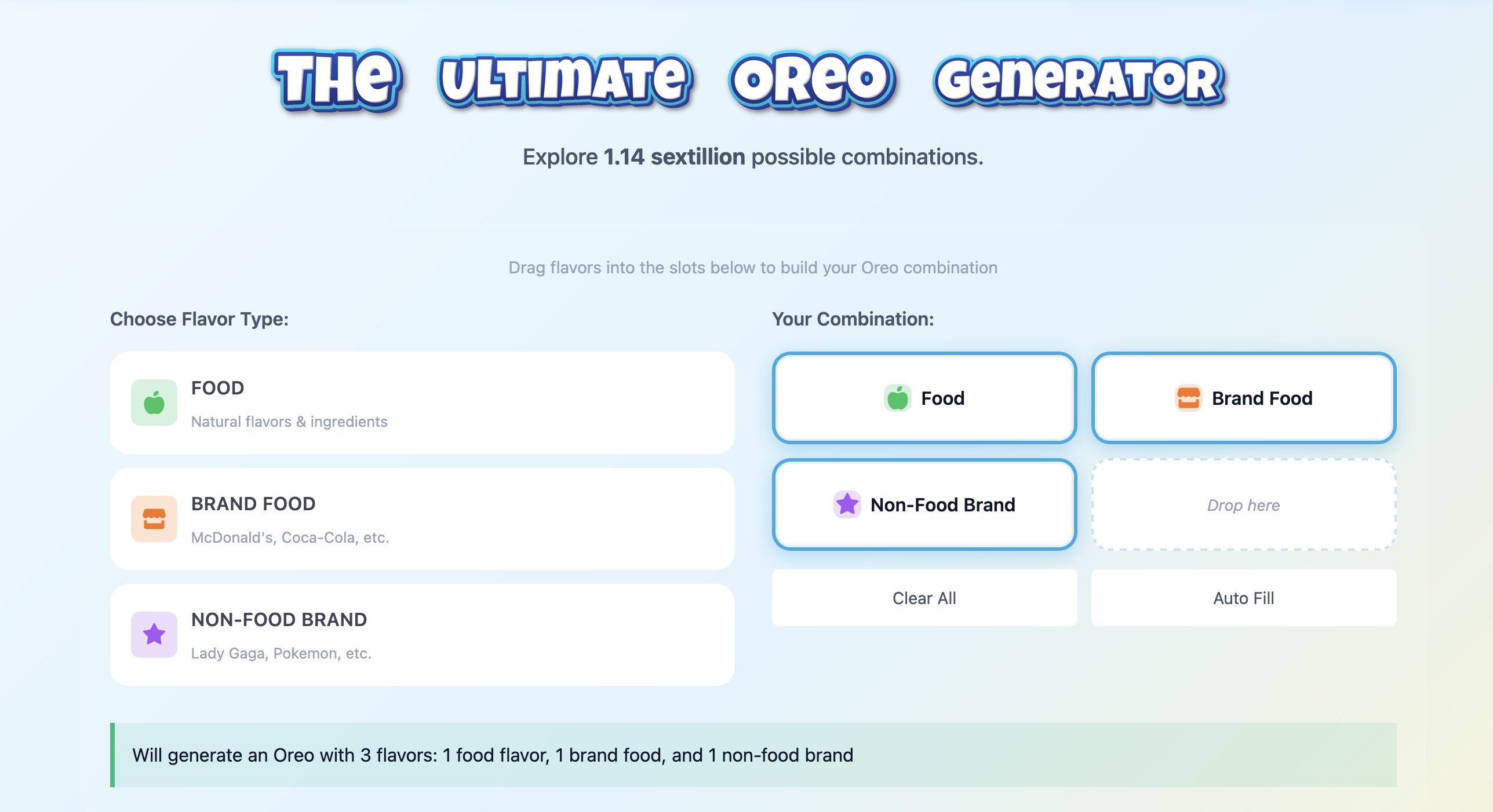
How I Built an Oreo Generator with 1.1 Sextillion Combinations
Building a web app that generates 1,140,145,285,551,550,231,122 possible Oreo flavor combinations using NestJS and TypeScript.

AI Model Names Are The Worst (tier list)
A comprehensive ranking of every major AI model name, from the elegant to the unhinged. Because apparently naming things is the hardest problem in AI.