USA Flag in CSS
March 06, 2020
Recreating the Stars and Stripes of the United States Flag in CSS is another fun exercise to practice your CSS skills. Although each element of the flag can be recreated in numerous ways, we're going to try to keep it as simple as possible.
Background and Colors
The official colors are Old Glory Red (#B22234) and Old Glory Blue (#3C3B6E), but using those colors makes the flag look a little washed out on the web, so we're going to use #9b1c2c for red and #041E42 for blue. We can create a simple linear-gradient that goes from left-to-right by rotating the default linear-gradient position by 90deg.
1.<div class="container"></div>
1.body {2. margin: 0;3. padding: 0;4. box-sizing: border-box;5.}6..container {7. display: flex;8. justify-content: center;9. align-items: center;10. height: 100vh;11. width: 100vw;12. background: linear-gradient(90deg, #041e42 20%, #9b1c2c 100%);13.}

Flag container
The official dimensions of the flag, from Wikipedia, indicate that width should be 1.9 the height, but we will approximate this by setting the width to 900px and the height to exactly half, 450px. We can scale the flag down using the transform property and scale() function at various screen widths to make our flag responsive. Finally, we're going to overlay the blue star section over the stripes using position: absolute, so we need to set this flag container to have position: relative.
1.<div class="container">2. <div class="USA-flag"></div>3.</div>
1..USA-flag {2. width: 900px;3. min-width: 900px;4. height: 450px;5. box-shadow: 0px 20px 80px 10px rgba(0, 0, 0, 0.25);6. position: relative;7.}8.9.@media (max-width: 1000px) {10. .USA-flag {11. transform: scale(0.75);12. }13.}14.@media (max-width: 725px) {15. .USA-flag {16. transform: scale(0.5);17. }18.}19.@media (max-width: 475px) {20. .USA-flag {21. transform: scale(0.375);22. }23.}24.25.@media (max-width: 340px) {26. .USA-flag {27. transform: scale(0.325);28. }29.}

USA Stripes CSS
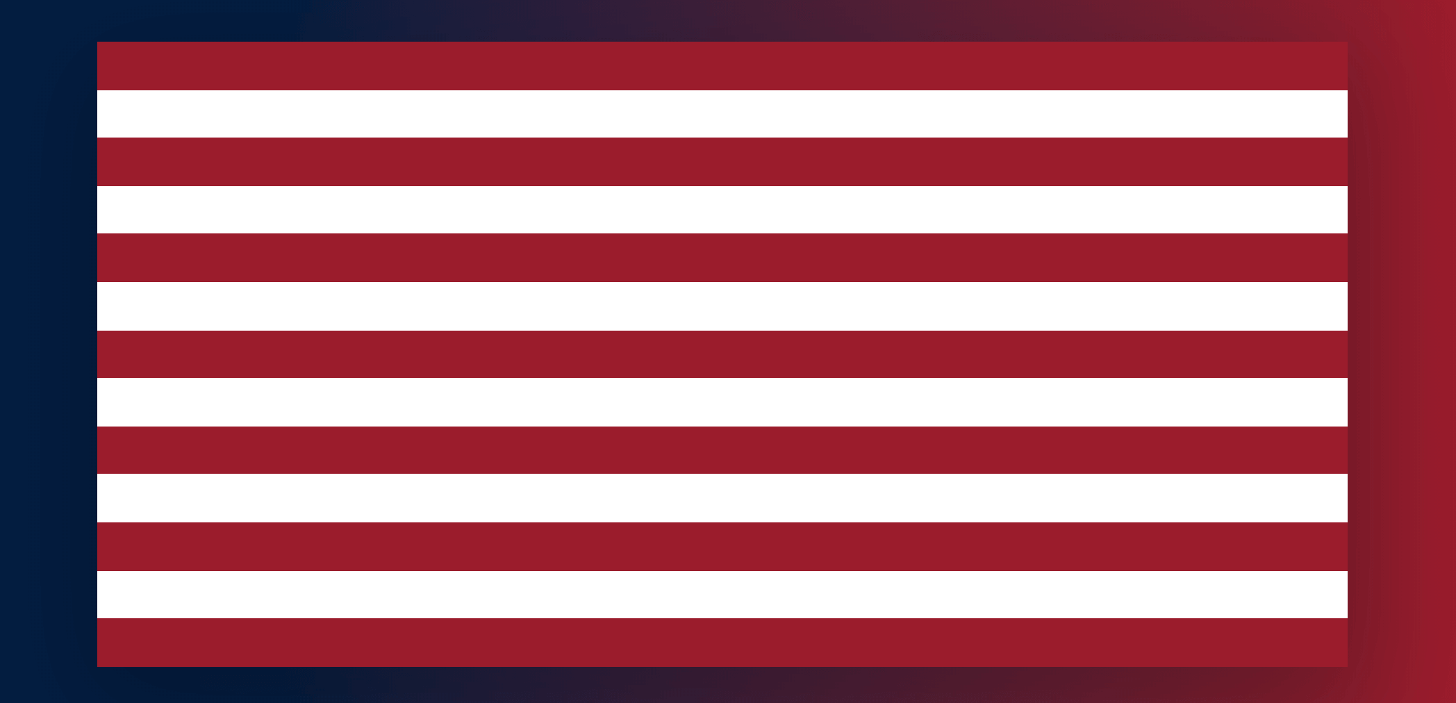
The USA flag has 13 stripes, 7 red stripes and 6 white, of equal height and width. One easy way to create this with CSS is to set the background to white and add 7 red stripes evenly spaced. However, if you want to add an animation to the stripes, or want more control over each stripe individually, then creating a separate HTML element for each stripe makes sense. Create 13 divs with the class name stripe and every other one stripe with the class name stripe stripe--white. Since each needs to be the exact same height, we can use the CSS function calc() to divide the total height of the flag (450px) by 13 to get the exact height needed for each stripe.
1....2.<div class="USA-stripes">3. <div class="stripe"></div>4. <div class="stripe stripe--white"></div>5. <div class="stripe"></div>6. <div class="stripe stripe--white"></div>7. <div class="stripe"></div>8. <div class="stripe stripe--white"></div>9. <div class="stripe"></div>10. <div class="stripe stripe--white"></div>11. <div class="stripe"></div>12. <div class="stripe stripe--white"></div>13. <div class="stripe"></div>14. <div class="stripe stripe--white"></div>15. <div class="stripe"></div>16.</div>17....
1..stripe {2. background-color: #9b1c2c;3. width: 100%;4. height: calc(450px / 13);5.}6..stripe--white {7. background-color: white;8.}
USA Blue Star Background
Since we set position:relative on the flag container, we can easily overlay the blue star background ontop of the stripes by using position:absolute, top: 0, and left:0. The blue background size stretches to the edge of the 7th stripe. This means that the height of the blue background is equivalent to the height of 7 stripes. From above, the height of a stripe is calc(450px / 13), so 7 times that height gives us the correct height calc((450px / 13) * 7). We also need to set a bit of padding to push the stars out from the edge of the blue background.
1.<div class="container">2. <div class="USA-flag">3. <div class="USA-stars"></div>4. <div class="USA-stripes">...</div>5. </div>6.</div>
1..USA-stars {2. position: absolute;3. top: 0;4. left: 0;5. width: 378px;6. height: calc((450px / 13) * 7);7. background-color: #041e42;8. z-index: 1;9. padding: 12px;10. box-sizing: border-box;11. display: flex;12. flex-direction: column;13. justify-content: space-between;14.}

USA Stars CSS
Alfred Genkin's article, Five Methods for Five-Star Ratings, dives into the tradeoffs of creating star shapes using HTML and CSS. The pure CSS methods are, while quite impressive, complicated and tricky to implement. For this tutorial, we're going to use the suggested method from that article, the Unicode character ★ which you can copy and paste straight into the HTML. One problem with Unicode characters, unfortunately, is that they often contain extra margins built into the glyph itself, which can mess up the spacing of each element. For this particular glyph, we can add margin-top: -4px to offset some of the glyph's internal margins.
1.<div class="star">★</div>
1..star {2. font-size: 20px;3. color: white;4. display: flex;5. justify-content: center;6. margin-top: -4px;7.}

Star Rows
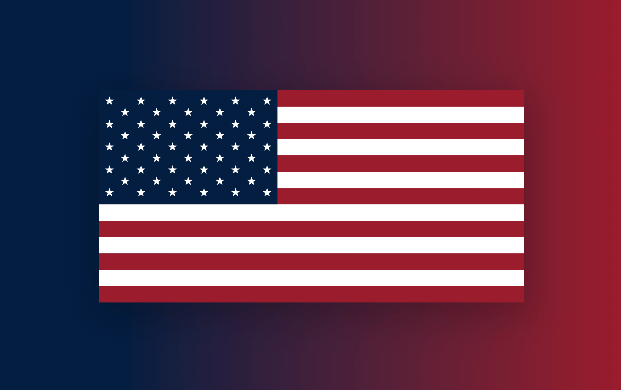
The USA flag has 50 stars broken into 9 rows that alternate between 6 stars and 5 stars per row. For both types of rows, we need to space each star out evenly across the container. We can do this easily with flexbox by setting justify-content to space-between.
1.<div class="star-row">2. <div class="star">★</div>3. <div class="star">★</div>4. <div class="star">★</div>5. <div class="star">★</div>6. <div class="star">★</div>7. <div class="star">★</div>8.</div>
1..star-row {2. display: flex;3. justify-content: space-between;4.}

Rows with 5 stars, however, need to be inset from both sides so that they fill the "gaps" in between rows with 6 stars. We can do this by simply adding padding on either side of the row.
1.<div class="star-row star-row--five">2. <div class="star">★</div>3. <div class="star">★</div>4. <div class="star">★</div>5. <div class="star">★</div>6. <div class="star">★</div>7.</div>
1..star-row--five {2. padding: 0px 33px;3.}
Finally, just add the rest of the rows with the appropriate number of stars for each row.
Expanding the Demo
We could expand this demo by adding a flag pole, making the flag wave in the wind, or fold the flag up in an interesting way. One example, that I made a few years ago, spins the stars around and animates the stripes downward. Click rerun to see the animation again.