10 Dropdown Menu Animations with CSS Transforms
March 18, 2020
Dropdown menus allow the user to see more information about a particular topic without overwhelming the page with too much information. Most dropdown menu animations follow one of two patterns, animating the whole menu as a group or animating each item within the menu individually. CSS transforms allow us to animate either pattern with great performance because CSS transforms affect the Composite step in your browser's Critical Rendering Path rather than the Paint, Layout, or Styles step. Below are five animations using CSS transforms for both the whole menu and each item individually. The CSS syntax is Stylus, which is a similar to SASS.
While animations can add some fun visual flair, keep in mind these examples are slightly exaggerated to make the mechanics of the animation more obvious.
Animating the Whole Dropdown Menu
The structure is the same for all menus: dropdown is the container for the menu title and the hidden menu. dropdown_menu is the actual menu itself, which is by default hidden.
1.<li class="dropdown dropdown-6">2.Scale Down3. <ul class="dropdown_menu dropdown_menu--animated dropdown_menu-6">4. <li class="dropdown_item-1">Item 1</li>5. <li class="dropdown_item-2">Item 2</li>6. <li class="dropdown_item-3">Item 3</li>7. <li class="dropdown_item-4">Item 4</li>8. <li class="dropdown_item-5">Item 5</li>9. </ul>10.</li>
The dropdown_menu is displayed only when the whole dropdown (the title and button) is hovered. This will display the dropdown menu on hover without any animations.
1..dropdown_menu2. position: absolute3. top: 100%4. left: 05. width: 100%6. perspective: 1000px7. display: none8..dropdown:hover .dropdown_menu--animated9. display: block
To animate the menu we need to add the animation property to the dropdown_menu. The animation-name property should be set the name we give to the @keyframes rule, in this case, growDown. The animation-fill-mode property defines what styles should be applied at the end of the animation. In our case, we are animating the menu from the closed state to the open state. This means we want the dropdown menu to preserve the styles of the final animation state, the value forwards allows us to do that.
1..dropdown_menu-62. animation: growDown 300ms ease-in-out forwards
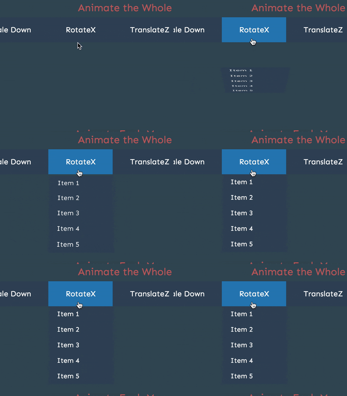
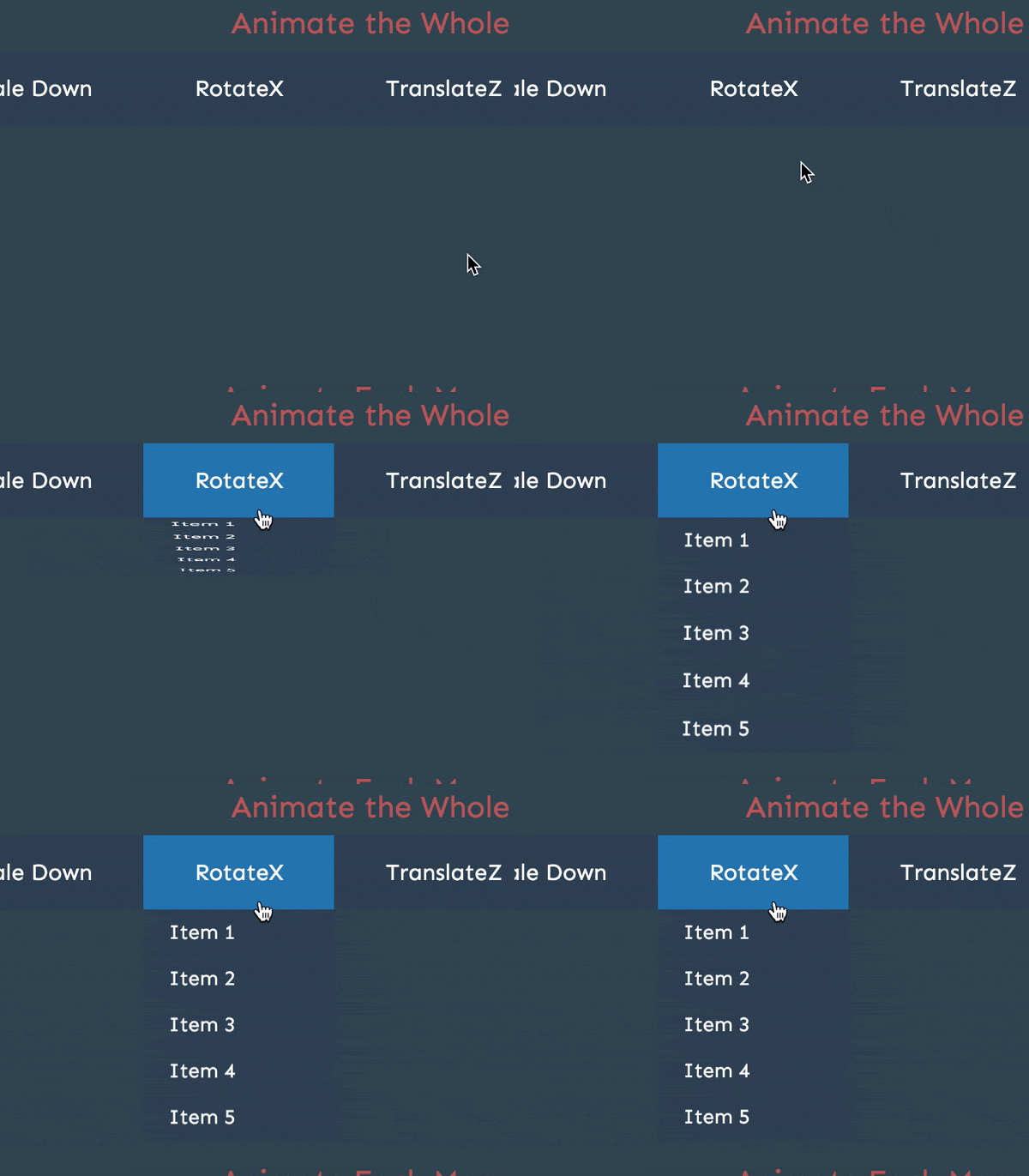
The last property we need to consider is transform-origin, which defines where the animation is applied. For our animations, this property defines where the menu originates from physically. The default setting of transform-origin will scale the menu from the "center of the menu" not from the button. For example, animating the roateX transform property will look like this with the default transform-origin value.

Changing transform-origin to top center will make the animation rotate from the button.
1..dropdown_menu-62. animation: growDown 300ms ease-in-out forwards3. transform-origin: top center

We can choose from any of the 21 transform functions to animate our menu using a @keyframes rule. The only rule we need to follow is that the final state of the animation, the 100% property, must be the normal state for the menu being open. For example, if we animate the scaleY of the menu, we need to make sure that scaleY is set to 1 so the menu looks normal when the animation is finished.
You'll notice that each animation "goes past" the intended end state around 80% or 70% then returns to the end state at 100%. This is a common technique in animation to create the illusion of momentum or "bounce" to give it more of a natural feel. Two examples are shown below, but check the Codepen above for more examples.
1.@keyframes growDown {2. 0% {3. transform: scaleY(0)4. }5. 80% {6. transform: scaleY(1.1)7. }8. 100% {9. transform: scaleY(1)10. }11.}
1.@keyframes rotateMenu {2. 0% {3. transform: rotateX(-90deg)4. }5. 70% {6. transform: rotateX(20deg)7. }8. 100% {9. transform: rotateX(0deg)10. }11.}
Animating Each Menu Item
The HTML structure is identical to animating the whole menu. Each menu item, however, needs to set opacity to 0 in addition to setting display: none. We do this is because we don't want all menu items to be visible immediately, like we did when animating the whole menu. Instead, we will animate each into view individually by animating opacity with a transform.
1..dropdown_menu li2. display: none3. color: white4. background-color: #34495e5. padding: 10px 20px6. font-size: 16px7. opacity: 08. &:hover9. background-color: #2980b910.11..dropdown:hover .dropdown_menu li12. display: block
Animating the whole menu meant we only needed to add an animation for each menu, but animating each menu item individually means we need to add a separate animation property for each menu item. Fortunately, all menu items will share the same @keyframe rule, same duration, same timing function, same animation-fill-mode, and same transform-origin property. The only property that needs to be different is the animation-delay to stagger each item's animation.
We could manually write a CSS selector for each dropdown menu item with a different animation-delay or we can take advantage of Stylus's for loop to iterate over each and generate those selectors automatically. The end result will be the same so let's use a for loop to make our lives easier.
There are five menu items for each dropdown, to iterate five times we can use the following syntax: for num in (1..5). Each dropdown_item has a class with a sequential number: dropdown_item-1, dropdown_item-2, etc. Therefore, we can select each by using the num variable and selector interpolation: .dropdown_item-{num}. Finally, we can use the num variable to delay each item by an even amount. If the animation duration is 300ms and there are 5 items overall, then we can delay each item by 60ms increments: (num * 60ms). Putting this all together produces the following:
1..dropdown_menu-22. for num in (1..5)3. .dropdown_item-{num}4. animation: rotateX 300ms (num * 60ms) ease-in-out forwards5. transform-origin: top center
The @keyframe rules are almost the exact same as the whole menu animations, with the exception of also animating opacity from 0 to 1.
1.@keyframes rotateX {2. 0% {3. opacity: 0;4. transform: rotateX(-90deg);5. }6. 50% {7. transform: rotateX(-20deg);8. }9. 100% {10. opacity: 1;11. transform: rotateX(0deg);12. }13.}


