Creating a Material Dev.to Client on Six Platforms with 100% Code Sharing
December 09, 2019
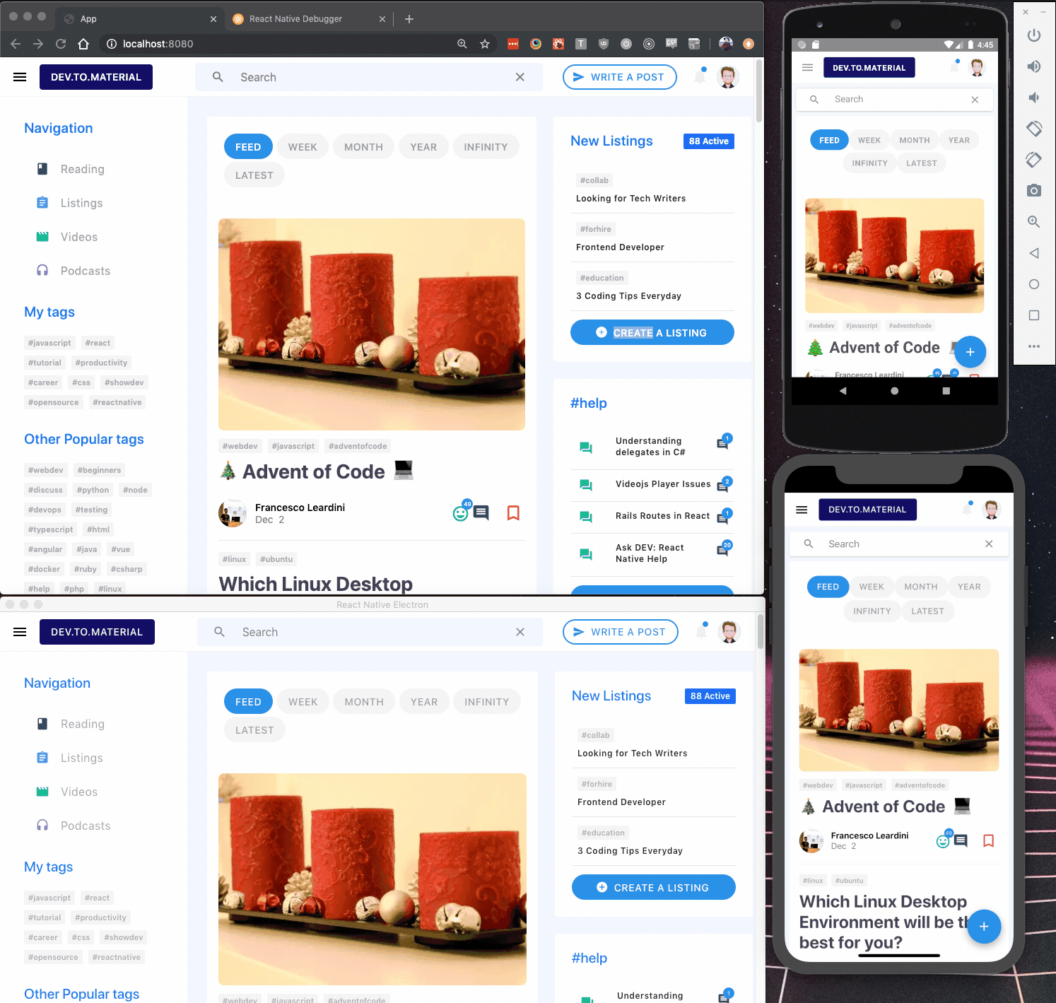
Dev.To.Material is a simple Material Dev.to client built with React Native that runs on the Web, Android, iOS, and Electron (Windows, Linux, and MacOS). All code is shared between each platform using React Router, React Native Web, Material Bread, and more.
Unfortunately, much of the Dev.to API is undocumented and authentication with oauth2 is in a private alpha. Therefore, although much of the UI for the Home page and Article page has been created, much of the functionality has not been implemented yet. Currently, however, you can click on articles, sort articles by topic button (feed, week, etc), search articles by tags, and click on tags to sort.
This article provides a small guide on how to build a React Native app across six platforms while sharing 100% of the code.
- Setting up a Mono Repo
- Cross-Platform Router
- Cross-Platform Utilities and Fonts
- Cross-Platform UI Components and Layout
- Cross-Platform Styles and Responsiveness
- Dev.to API
- Rendering Post HTML Cross-Platform
- Conclusion
Setting up a Cross-Platform MonoRepo
Sharing code within a monorepo is significantly easier than sharing code across multiple repos. Additionally, sharing code within a React Native mono repo is surprisingly simple to setup. Essentially, each platform has its own folder that contains the configuration necessary to render the app on that platform. You can learn more about this in my previous article, Creating a Dynamic Starter Kit for React Native.
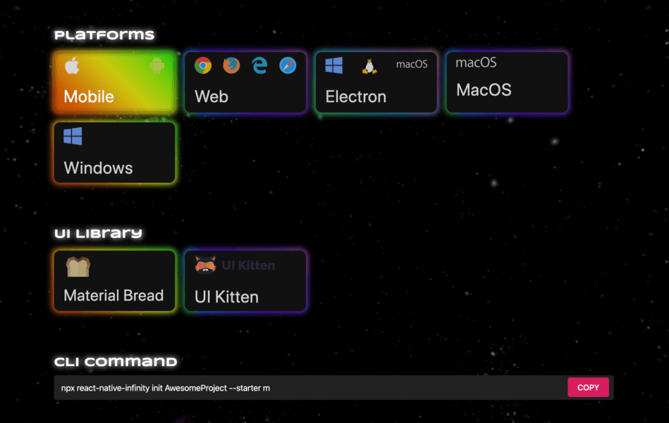
We're going to use react-native-infinity to generate the minimum configuration required to share code across all platforms. Simply initialize a new project with the name, platforms, and UI library you want to use.
1.npx react-native-infinity init
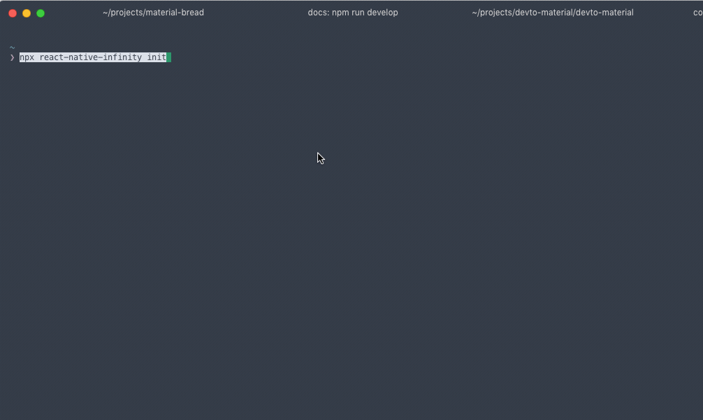
Follow the instructions printed in the terminal to complete the setup.
We now have a cross-platform monorepo that renders the src folder on all platforms. While developing, it's important to constantly test changes on multiple platforms and screen sizes. Often a seemingly insignificant change on one platform can completely break on a different platform.
Cross-Platform Router
Both react-router and react-navigation support web and native routers. However, I kept running into problems with React Navigation, and overall found it much more difficult to use and customize. React Router, on the other hand, was extremely easy to setup and I never ran into any problems. To set up React Router across platforms, we need to install three packages, react-router, react-router-dom, react-router-native.
1.npm install react-router react-router-dom react-router-native
react-router-dom and react-router-native provide the same components (Router, Route, Link, etc) for the web and native (iOS and Android) respectively. All we need to do is import the correct components for each platform. This is easily done using Native-specific extensions, which selects files for particular platforms based off the file extension.
Create a new file src/Router/index.js that exports the react-router-native components.
1.export {2. NativeRouter as Router,3. Route,4. Switch,5. Link,6. } from "react-router-native";
In the same folder, create the file src/Router/index.web.js that exports the react-router-dom components.
1.export { BrowserRouter as Router, Route, Switch, Link } from "react-router-dom";
Whenever we need to use the router we can import the components from our local folder Router, and the bundler should pick up the correct file.
Next, create the src/Routes.js file to house all the pages in the app. As mentioned above, import the router components from our local folder, Router, rather than the react-router-* packages.
1.// src/Routes.js2.3.import React from "react";4.import { View } from "react-native";5.6.import Home from "./Screens/Home";7.import Post from "./Screens/Post";8.9.import { Route, Router, Switch } from "./Router";10.11.function Routes() {12. return (13. <Router>14. <View style={{ backgroundColor: "#f2f6ff", minHeight: "100%" }}>15. <Switch>16. <Route exact path="/" component={Home} />17. <Route exact path="/post/:id" component={Post} />18. </Switch>19. </View>20. </Router>21. );22.}23.24.export default Routes;
Now, create two very simple screens with Link components to navigate back and forth.
1.// src/Screens/Home.js2.3.import React from "react";4.import { View, Text } from "react-native";5.import { Link } from "../Router";6.7.export default function Home() {8. return (9. <View>10. <Link to="/post/1">11. <Text>To Post</Text>12. </Link>13. </View>14. );15.}
1.// src/Screens/Post.js2.3.import React from "react";4.import { View, Text } from "react-native";5.import { Link } from "../Router";6.7.export default function Home() {8. return (9. <View>10. <Link to="/post/1">11. <Text>To Post</Text>12. </Link>13. </View>14. );15.}
Finally, update src/App.js to use the new Routes we setup.
1.import React from "react";2.import { View } from "react-native";3.import Routes from "./Routes";4.5.export default class App extends React.Component {6. render() {7. return (8. <View>9. <Routes />10. </View>11. );12. }13.}
You should now be able to navigate between the Home screen and Post screen on each platform.
Cross-Platform Utilities and Fonts
Devices and platforms often have subtle differences that require special rules, for example, the Iphone X's notch. Therefore, we will need to apply styles and other logic per platform. Create src/Styles/device.js, as follows:
1.import { Platform } from "react-native";2.3.const isWeb = Platform.OS == "web";4.const isAndroid = Platform.OS == "android";5.const isIos = Platform.OS == "ios";6.7.export { isWeb, isAndroid, isIos };
We will often need to reference a device's screen width and height when building the layout. Create src/Styles/dimensions.js to export the dimensions
1.import { Dimensions, Platform } from "react-native";2.3.const screenHeight = Dimensions.get("window").height;4.const screenWidth = Dimensions.get("window").width;5.const trueHundredHeight = Platform.OS == "web" ? "100vh" : "100%";6.7.export { screenHeight, screenWidth, trueHundredHeight };
Next, create src/Styles/theme.js to hold the apps theme.
1.import { isWeb } from "./device";2.3.const theme = {4. background: "#f7f9fc",5. bodyBackground: "#f2f6ff",6. fontFamily: isWeb ? "Roboto, sans-serif" : "Roboto",7.};8.9.export default theme;
Finally, we need to provide the Roboto font for all platforms. Adding Roboto to the Web and Electron is quite simple, just add an import from Google Fonts in both web/index.html and electron/index.html, between two <style> tags.
1.@import url("https://fonts.googleapis.com/css?family=Roboto&display=swap");
Adding fonts to iOS and Android is a little more complicated, follow this excellent article to learn how.
Cross-Platform UI Components and Layout
Creating a user interface across screens sizes, platforms, and devices is extremely time consuming. The more components we can share across platforms, the better. With that in mind, we're going to Material Bread which provides Material Design components that work across all platforms. If you added Material Bread with React Native Infinity, then everything is setup already, if not then please visit the docs to get started.
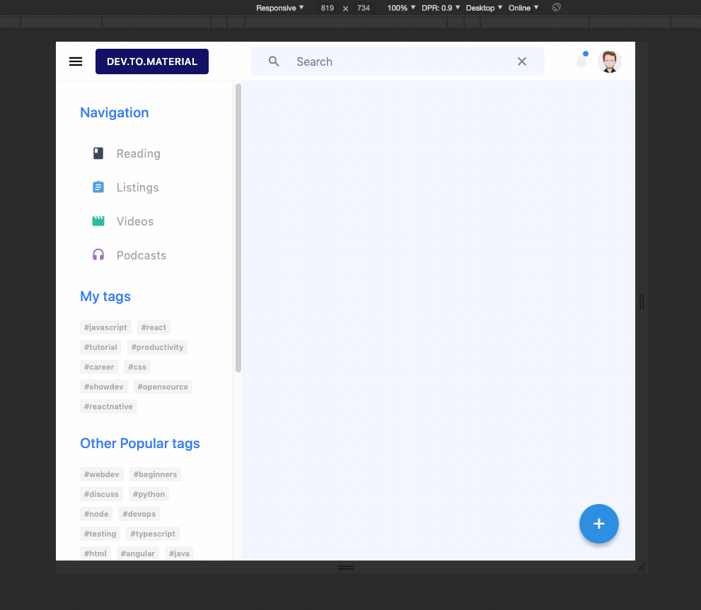
The essential layout is composed of an Appbar, Drawer, and the actual page Content. These can be shared across platforms, but they need to act differently depending on the screen width and screen size.
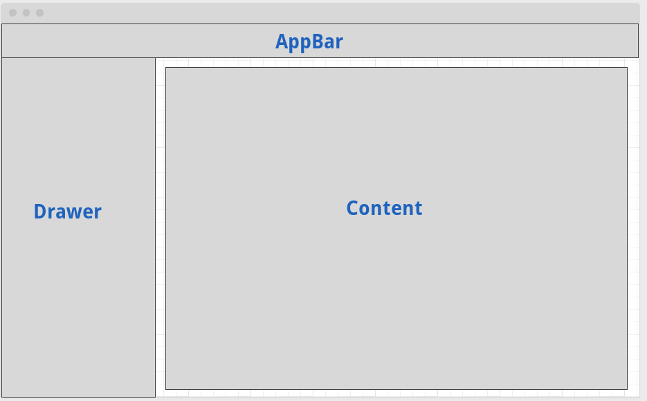
We can create this structure easily with the Drawer component. Page content is rendered as a child of the Drawer component and the Appbar is rendered by the appbar prop.
1.// src/Screens/Home.js2.3.import React, { useState } from "react";4.import { View, Text, Platform, StyleSheet } from "react-native";5.import { Drawer } from "material-bread";6.import { trueHundredHeight } from "../Styles/dimensions";7.import theme from "../Styles/theme";8.9.export default function Home() {10. const [isOpen, setisOpen] = useState(true);11.12. return (13. <Drawer14. open={isWeb ? true : isOpen}15. type={"permanent"}16. onClose={() => setisOpen(false)}17. drawerContent={18. <View>19. <Text>Drawer Content</Text>20. </View>21. }22. style={styles.pageContainer}23. drawerStyle={styles.drawer}24. appbar={<View style={styles.appbar} />}25. >26. <View style={styles.body}>27. <View style={{ flexDirection: "row" }}></View>28. </View>29. </Drawer>30. );31.}32.33.const styles = StyleSheet.create({34. pageContainer: {35. height: "auto",36. minHeight: trueHundredHeight,37. backgroundColor: theme.background,38. },39. drawer: {40. borderRightWidth: 0,41. height: "100%",42. },43. body: {44. width: "100%",45. paddingTop: 34,46. backgroundColor: theme.bodyBackground,47. padding: 34,48. minHeight: trueHundredHeight,49. },50. appbar: {51. height: 56,52. width: "100%",53. },54.});
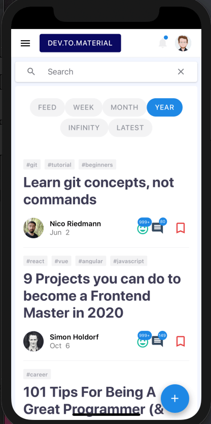
Although this layout will work across platforms, it won't look good across screen sizes. For example, the drawer will stay open on very small screen sizes and hide all of the content. Therefore, the next problem we need to tackle is responsive styles.
Cross-Platform Styles and Responsiveness
An initial approach at cross-platform responsiveness is use the Dimensions property to create breakpoints.
1.const isMobile = Dimensions.get("window").width < 767;
The obvious problem is that the values won't update when the width of the window changes. Another approach, is to use React Native's onLayout prop to listen for layout changes on a particular component. A library like react-native-on-layout can make this easier, but it's not ideal in my opinion. Other packages for adding responsivess to React Native are not well supported on the web.
Instead, we can create a hybrid approach by using react-responsive to provide media queries for browsers and use dimensions for native.
1.const isMobile =2.Platform.OS == "web" ? useMediaQuery({ maxWidth: 767 }) : screenWidth < 767;
This will update when the browser width is resized and respond to the breakpoint for mobile devices. We can expand this and create some useful responsive components to use across the app.
1.import { useMediaQuery } from "react-responsive";2.import { isWeb } from "./device";3.import { screenWidth } from "./dimensions";4.5.// Breakpoints6.const desktopBreakpoint = 1223;7.const tabletBreakpoint = 1023;8.const mobileBreakpoint = 767;9.10.// Native Resposive11.const isDesktopNative = screenWidth > desktopBreakpoint;12.const isLaptopOrDesktopNative = screenWidth > tabletBreakpoint + 1;13.const isLaptopNative =14. screenWidth > tabletBreakpoint + 1 && screenWidth < desktopBreakpoint;15.const isTabletNative =16. screenWidth < tabletBreakpoint && screenWidth > mobileBreakpoint + 1;17.const isTabletOrMobileNative = screenWidth < tabletBreakpoint;18.const isMobileNative = screenWidth < mobileBreakpoint;19.20.// Cross-Platform Responsive Components21.const Desktop = ({ children }) => {22. const isDesktop = isWeb23. ? useMediaQuery({ minWidth: desktopBreakpoint })24. : isDesktopNative;25. return isDesktop ? children : null;26.};27.28.const LaptopOrDesktop = ({ children }) => {29. const isDesktop = isWeb30. ? useMediaQuery({ minWidth: tabletBreakpoint + 1 })31. : isLaptopOrDesktopNative;32. return isDesktop ? children : null;33.};34.35.const Laptop = ({ children }) => {36. const isDesktop = isWeb37. ? useMediaQuery({38. minWidth: tabletBreakpoint + 1,39. maxWidth: desktopBreakpoint,40. })41. : isLaptopNative;42. return isDesktop ? children : null;43.};44.45.46.const Tablet = ({ children }) => {47. const isTablet = isWeb48. ? useMediaQuery({49. minWidth: mobileBreakpoint + 1,50. maxWidth: tabletBreakpoint,51. })52. : isTabletNative;53. return isTablet ? children : null;54. };55. const TabletOrMobile = ({ children }) => {56. const isTablet = isWeb57. ? useMediaQuery({58. maxWidth: tabletBreakpoint,59. })60. : isTabletOrMobileNative;61. return isTablet ? children : null;62. };63. const Mobile = ({ children }) => {64. const isMobile = isWeb65. ? useMediaQuery({ maxWidth: mobileBreakpoint })66. : isMobileNative;67. return isMobile ? children : null;68. };69.70. export {71. mobileBreakpoint,72. tabletBreakpoint,73. desktopBreakpoint,74. isDesktopNative,75. isLaptopOrDesktopNative,76. isLaptopNative,77. isTabletNative,78. isTabletOrMobileNative,79. isMobileNative,80. Desktop,81. LaptopOrDesktop,82. Laptop,83. Tablet,84. TabletOrMobile,85. Mobile,86. };
For example, we can use this to only show the Appbar button "Write a post" on laptop screen sizes and above:
1.// src/Components/Appbar/Appbar.js2....3.actionItems={[4. <LaptopOrDesktop key={1}>5. <Button6. text={"Write a post"}7. onPress={this.createPost}8. type="outlined"9. icon={<Icon name={"send"} />}10. radius={20}11. borderSize={2}12. style={{ marginRight: 8 }}13. />14.</LaptopOrDesktop>,15....
And then show the Fab button on tablet and mobile screen sizes.
1.// src/Components/Layout.js2....3.<TabletOrMobile>4. <Fab containerStyle={styles.fab} />5.</TabletOrMobile>6....
Applying the same logic to the Drawer, we can hide the Drawer on mobile. useMediaQuery's third argument takes a callback function and sends along whether the media query matches. We can use this to call setIsOpen to false when the window width is below the mobileBreakpoint.
1.const handleIsMobile = matches => setisOpen(!matches);2.3.const isMobile = useMediaQuery(4. { maxWidth: mobileBreakpoint },5. undefined,6. handleIsMobile7.);8.9.const [isOpen, setisOpen] = useState(isMobile ? false : true);
Lastly, we can set the Drawer type to modal, to match what we would expect on mobile.
1.<Drawer2.open={isOpen}3.type={isMobile ? "modal" : "permanent"}4....5./>6....
The rest of the UI was built using similar patterns. If you're interested, check out the github repo to see the rest of the components.
Dev.to API
The Dev.to API is still in beta and much of the functionality has not been documented yet. Therefore, for this app we will only be concerned with fetching posts. If more of the API were open, I might use a more robust state management system, but for now I'll simply create some hooks.
Let's write a simple async function to fetch posts with error handling.
1.// src/Screens/Home.js2....3.const [posts, setPosts] = useState(initialState.posts);4.const [isLoading, setIsLoading] = useState(initialState.isLoading);5.const [hasError, setHasError] = useState(initialState.hasError);6.7.const fetchPosts = async () => {8. setIsLoading(true);9.10. try {11.12. const result = await fetch(`https://dev.to/api/articles`);13. const data = await result.json();14. setPosts(data);15. setHasError(false);16. } catch (e) {17. setIsLoading(false);18. setHasError(true);19. }20.};21.useEffect(() => {22. fetchPosts();23.}, []);24.25. return (26. <Layout>27. <PostList posts={posts} hasError={hasError} isLoading={isLoading} />28. </Layout>29. );30....
Check out the Github Repo to see the PostList component.
The buttons on top of the main card list ("Feed", "Week", etc) are simple filters on the request above. Week, for example, can be fetched by appending top=7 to the original request.
1.https://dev.to/api/articles/?top=7
We can create a simple function to append these queries onto the root url using the history object from React Router.
1.function HandleNavigate({ filter, type, history }) {2. const link = type ? `?${type}=${filter}` : "/";3.4. history.push(link);5. }
Then, back on the Home screen, we can use React Router's location object to append those queries to the fetch.
1.const fetchPosts = async () => {2. setIsLoading(true);3.4. try {5. const queries = location.search ? location.search : "/";6.7. const result = await fetch(`https://dev.to/api/articles${queries}`);8. const data = await result.json();9. setPosts(data);10. setHasError(false);11. setTimeout(() => {12. setIsLoading(false);13. }, 600);14. } catch (e) {15. setIsLoading(false);16. setHasError(true);17. }18.};
Lastly, we need to add the location object to second argument of useEffect so that it will fire fetchPosts when the location object has updated.
1.useEffect(() => {2. fetchPosts();3. }, [location]);4.
Tags (#javascript, #react, etc) work the exactly the same way. Simply pass the tag name into the query param tag. For example, this will fetch posts with the tag javascript.
1.https://dev.to/api/articles/?tag=javascript
Although we cannot implement a real search with the API currently (as far as I know) we can implement a simple tag search by following the same pattern and passing the input to the tag query param.
1.const [search, setSearch] = useState(initialState.search);2.3.function HandleNavigate(search) {4. if (!search) return;5. const link = search ? `?tag=${search}` : "/";6.7. history.push(link);8.}
Rendering Post HTML Cross-Platform
The process for fetching a specific post is similar to fetching a list of posts. Simply pass the postId to the /articles endpoint.
1.const fetchPost = async () => {2. setIsLoading(true);3. const postId = match && match.params && match.params.id;4.5. try {6. const result = await fetch(`https://dev.to/api/articles/${postId}`);7. const data = await result.json();8.9. setPost(data);10. setHasError(false);11. setIsLoading(false);12. } catch (e) {13. setIsLoading(false);14. setHasError(true);15. }16.};
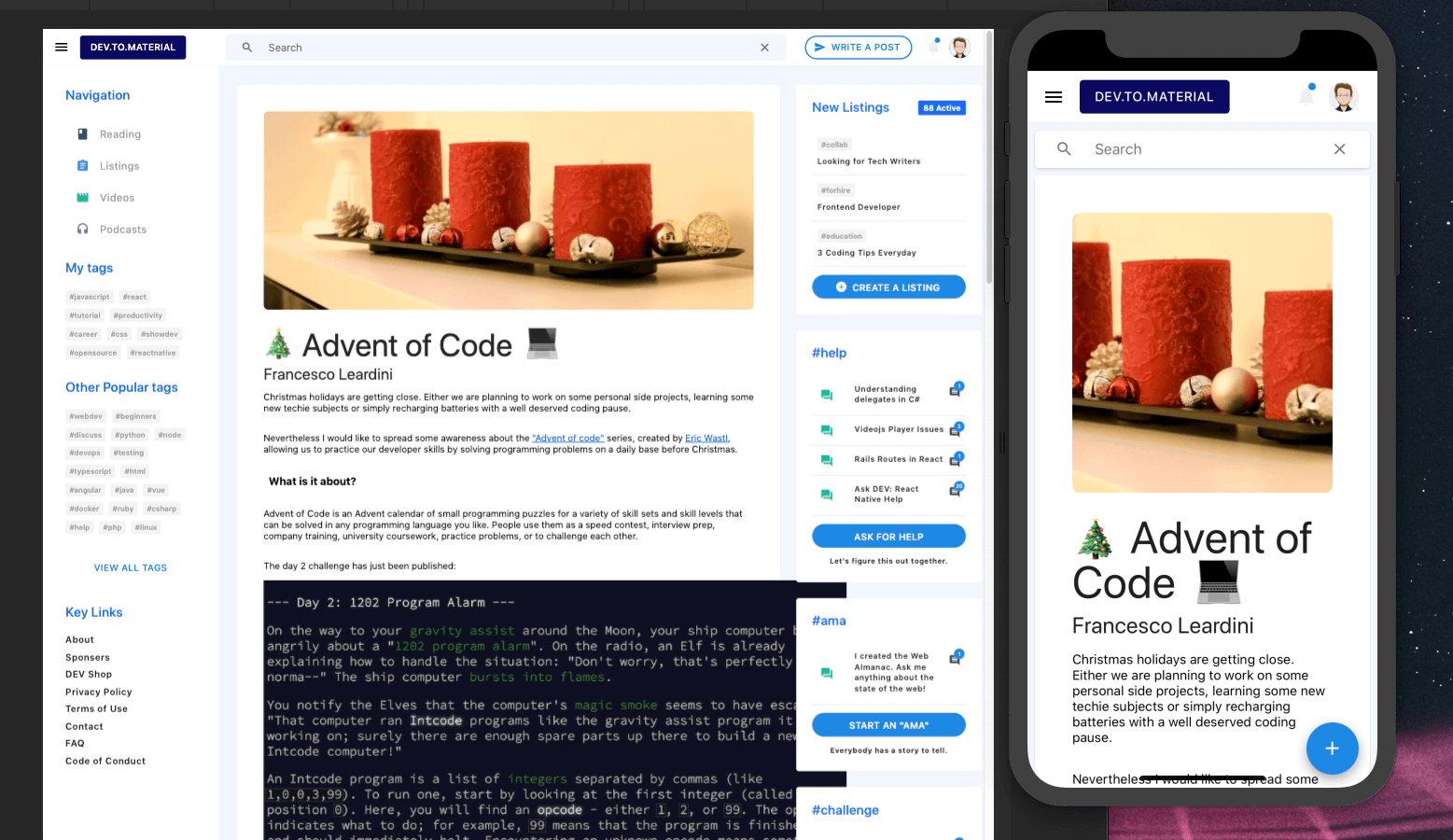
Displaying the post, however, is more tricky. The Dev.to API provides each post in two formats, html (body_html) and markdown (body_markdown). Although packages exist to render markdown on each platform, I found it difficult to get each post to render correctly on all platforms. Instead we can accomplish this by using the post html.
For web apps, we could use dangerouslySetInnerHtml to render a full post, but obviously this won't work on React Native. Instead we can use an excellent package, react-native-render-html.
First, we need to transform react-native-render-html with Webpack, replace the exclude line in both web/webpack.config.js and electron/webpack.config.js with the following:
1.test: /.(js|jsx)$/,2.exclude: /node_modules/(?!(material-bread|react-native-vector-icons|react-native-render-html)/).*/,
Then, pass the post.body_html to the HTML component from react-native-render-html.
1.// src/Screens/Post.js2.3....4.import HTML from "react-native-render-html";5....6.<Layout>7. <Card style={styles.postCard}>8. {post && post.cover_image ? (9. <Image10. source={{ uri: post && post.cover_image }}11. style={[ styles.postImage ]}12. />13. ) : null}14.15. <Heading type={3} text={post && post.title} />16. <Heading type={5} text={post && post.user && post.user.name} />17. {post && !isLoading ? (18. <HTML html={post.body_html} />19. ) : (20. <Loader isLoading={isLoading} />21. )}22. {hasError ? <Text>Something went wrong fetching the post, please try again</Text> : null}23. </Card>24.</Layout>25....
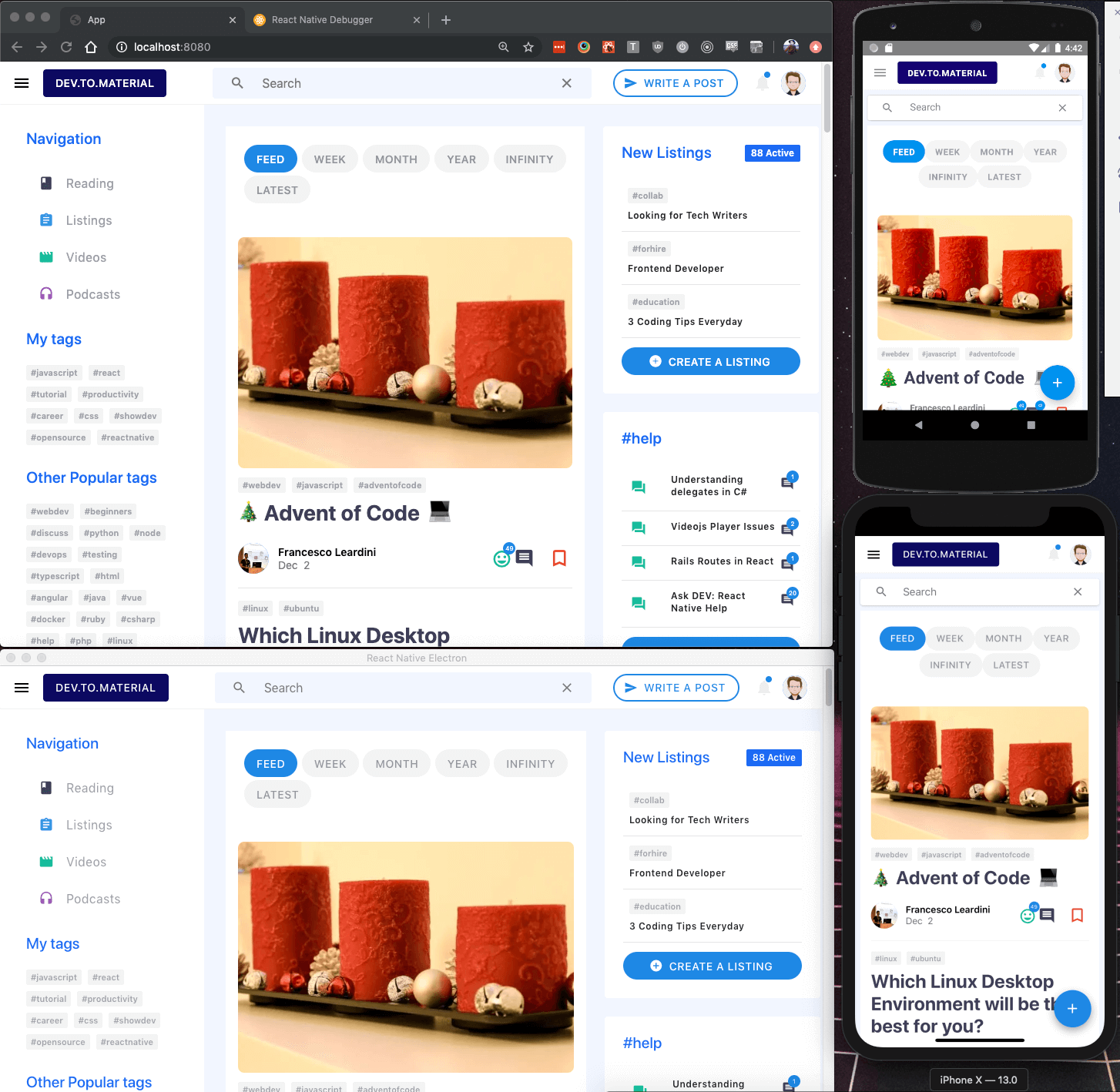
This works great across platforms, however, the post images are extending past the cards. react-native-render-html provides a prop imagesMaxWidth to set the image's max width, but it is not responsive. Unlike other responsive issues, we want the image's width to be determined by the containing Card, not the window width. So instead of using the responsive components we defined above, we need to fall back to use the onLayout prop described previously.
Add the onLayout prop <View> component with a callback function that sets the cardWidth equal to Card. Then set the imagesMaxWidth prop on the HTML component to the cardWidth.
1.const [cardWidth, setCardWidth] = useState(initialState.cardWidth);2.const onCardLayout = e => {3. setCardWidth(e.nativeEvent.layout.width);4.};5....6.<Card style={styles.postCard}>7. <View onLayout={onCardLayout}>8. ...9. {post && !isLoading ? (10. <HTML html={post.body_html} imagesMaxWidth={cardWidth} />11. ) : (12. <Loader isLoading={isLoading} />13. )}14. </View>15.</Card>16....
Now the post's image will update its width whenever the PostCard width is updated.
Conclusion
React Native, along with many other tools, allows us to write one app and render it on many platforms. Although there are certainty aspects that need improvement, like responsiveness and animations, the fact that a small team can reasonably build apps for multiple platforms without expertise in multiple languages and platforms really opens the playing field for solo developers or smaller companies.
Having said that, React Native development can also be quite frustrating. For example, I wasted a few hours in Github issues and StackOverflow trying to get the bundle to load on iOS, react-native bundle hangs during "Loading", and trying to get Xcode and iOS 13 to work correctly, Unknown argument type ‘attribute’ in method. Furthermore, while building Material Bread, I found z-index barely works on Android. These aren't necessarily deal breakers, but spending all this time on problems like these can really stall development.
Despite these issues, all the code in this project is 100% shared on all platforms, only a few components required any logic specific to a platform. Obviously, I didn't cover every part of the app, but feel free to ask or check out the Github Repo to learn more.
You Might Also Like
Creating a Dynamic Starter Kit for React Native - React Native Infinity
React Native Infinity CLI generates React Native projects that target any combination of platforms (Web, Electron, Windows, MacOS)

Build and Deploy a React Native Web App on Netlify from Scratch
Learn how to build www.howtoexitvim.org with React Native Web and deploy on Netlify from scratch

Introducing React SPA, the Framework™
Tired of SRR? Save time by building a SPA. It's not just a framework; it's the absence of one.